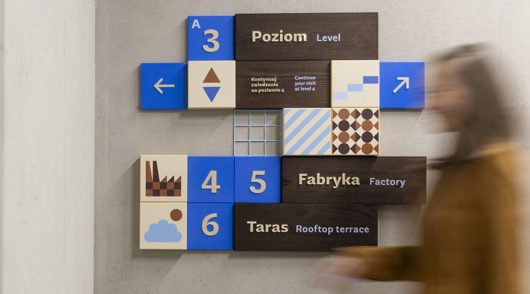
The project won GERMAN DESIGN AWARD 2025: Excellent Architecture - Wayfinding and Signage WINNER!
Wayfinding at Chocolate Factory is designed to look like a box of chocolates. It features cubes of varying thicknesses and praline-like colors, with patterns inspired by Wedel’s famous sweets, guiding visitors from the ticket counters to the rooftop terrace. The curvy wood texture mimics dark chocolate, while the colorful tiles appear to be coated in sweet icing. Icons represent key museum functions, with a playful design that even young children can follow. Directional signage is strategically placed on glass and concrete walls, suspended from ceilings, and marked on floors to facilitate smooth navigation throughout the facility.
Chocolate Factory Museum aimed for signage that was readable and distinctive, appealing primarily to children. The design needed to be playful and aligned with the brand's visual identity. Additionally, due to restricted access and factory sanitation requirements, visitor routes are quite complex, making wayfinding essential to help guests navigate through the unconventional pathways.
The icon design was created in cooperation with the Homework studio, the author of the visual identification of the Chocolate Factory, and referred to the patterns they designed.
Scope of signage: Entrance zone, cafe, ticket offices and shop, cloakroom, toilets, workshop zone, rooftop terrace, vertical communication around the building. The exhibition was outside the scope of the study.
Production and assembly: Oznakuj Biuro
Photos: Anna Nowokunska-Maksymiuk | Studio Blisko
Chocolate Factory: www.fabrykaczekolady.pl