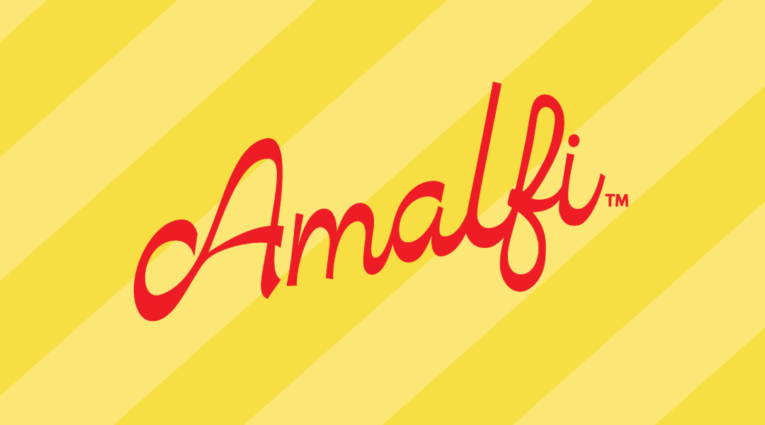
Amalfi says it all in the name - a quintessential Italian beverage with an equally Italian look to compliment the product. Designed to be in the refrigerator case at airport concessions, the Amalfi brand and design needed to be eye catching, memorable and most of all, feel like a vacation to the Italian coast. Inspired by old, nostalgic Italy, Amalfi’s design is more classic in its look, yet full of personality through its typography, illustration and patterning that is rich in color to really pop. The design is inspired by the legendary Italian hotels one would stay at. The background is a take on the iconic Italian resort’s striped umbrellas that line their beach front properties to create a sea of pattern. The typography and layout are inspired by the hotel's branded paper napkins one would get placed under their drink. The design also incorporates vintage fruit illustration giving immediate flavor cues to shoppers without having to read the label. An important factor for airport shoppers, who are often running off to make their flight. Lastly, the color palette is bright, fresh and bold. The colors were strategically chosen to compliment the eye catching colors of the soda themselves. Also when in a refrigerator case, bold colors allow for the most shelf standout. Overall, the Amalfi brand strikes a nice balance between being modern and retro as well as elegant and playful. A design that needed to feel routed in its Italian heritage while not taking itself too seriously because it is soda after all.