INDIGO DESIGN WINNER 2026
INDIGO DESIGN WINNER 2026
INDIGO DESIGN WINNER 2026
INDIGO DESIGN WINNER 2026
INDIGO DESIGN WINNER 2026
INDIGO DESIGN WINNER 2026
INDIGO DESIGN WINNER 2026
INDIGO DESIGN WINNER 2026
A More Intuitive Oura App
/by Instrument
2026 Agency Winner

Digital Design of the Year 2026
Gold Winner in UX, Interface & Navigation for Digital Design
Gold Winner in Interactive Design for Digital Design
Silver Winner in Apps for Digital Design
Created by:
Lead Designer
Instrument
Design Company
Instrument
Client
OURA
Design Team
Instrument
Credits:
Ademar Rodrigues, OURA Allan Salcedo-Orozco, OURA Alexandra Westerback, OURA Anna Grajek, OURA Brooke Docherty, OURA Brynn Harrington, OURA Colleen Simms, OURA Damian Winiarczuk, OURA Erika Sankari, OURA Geoff Koops, OURA James Breaux, OURA Janne Kaki, OURA Josip Parac, OURA Josue Espinosa, OURA Jussi Aitjarvi, OURA Julie Russo-Ryan, OURA Kara Caven, OURA Kriti Pachhandara, OURA Laura Furman, OURA Maitri Shah, OURA Marcin Banaszynski, OURA Minh Kiet Vuong, OURA Nichole Treadway, OURA Rebecca Plotnick, OURA Teemu Rossi, OURA Tyten Teegarden, OURA Jack Maize, OURA Veera Lindholm, OURA Remi Boille, Sr. Executive Producer at Instrument Chris Fairchild, Creative Director at Instrument Anna Harkness, Design Director at Instrument Kyle Roberts, Design Director at Instrument Varna Vasudevan, Strategy Lead at Instrument Lizelle Galaz Estrella, Strategy Director at Instrument Angela Liu, Senior Designer at Instrument Heather Weyda, Sr. Motion Designer at Instrument Loretta Rae, Senior Producer at Instrument
Description
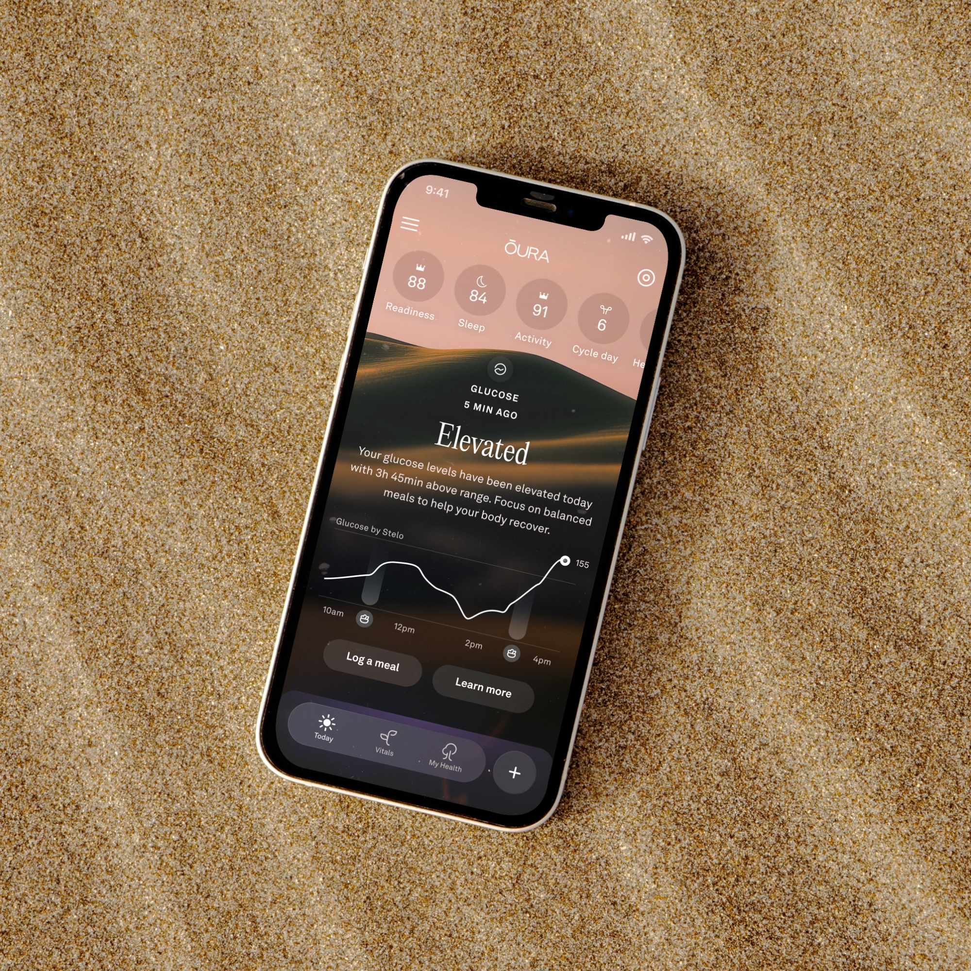
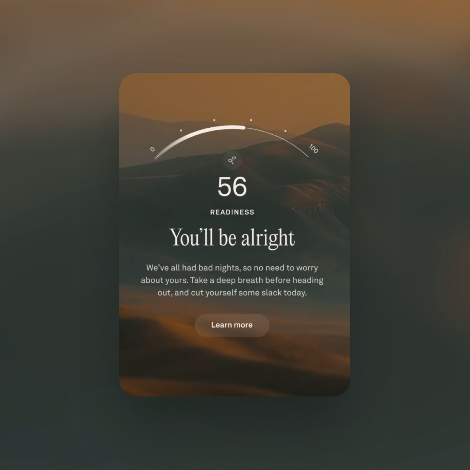
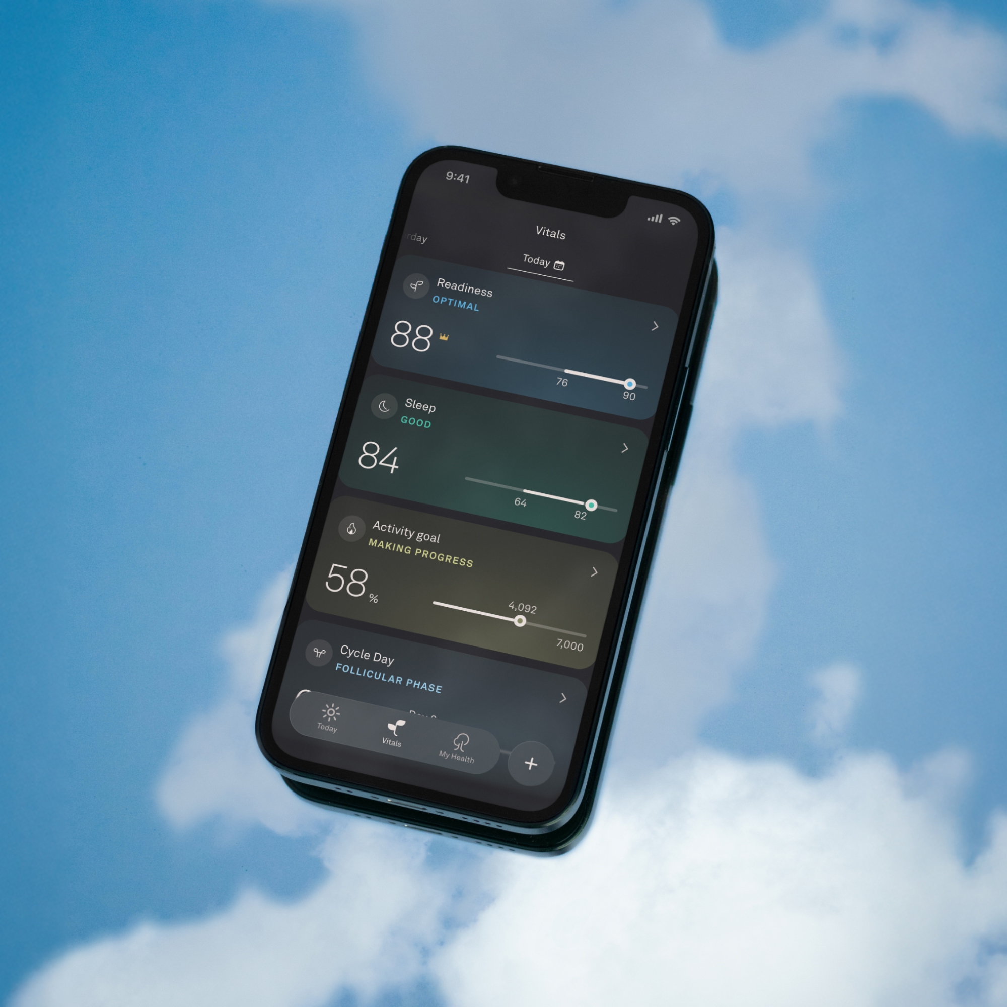
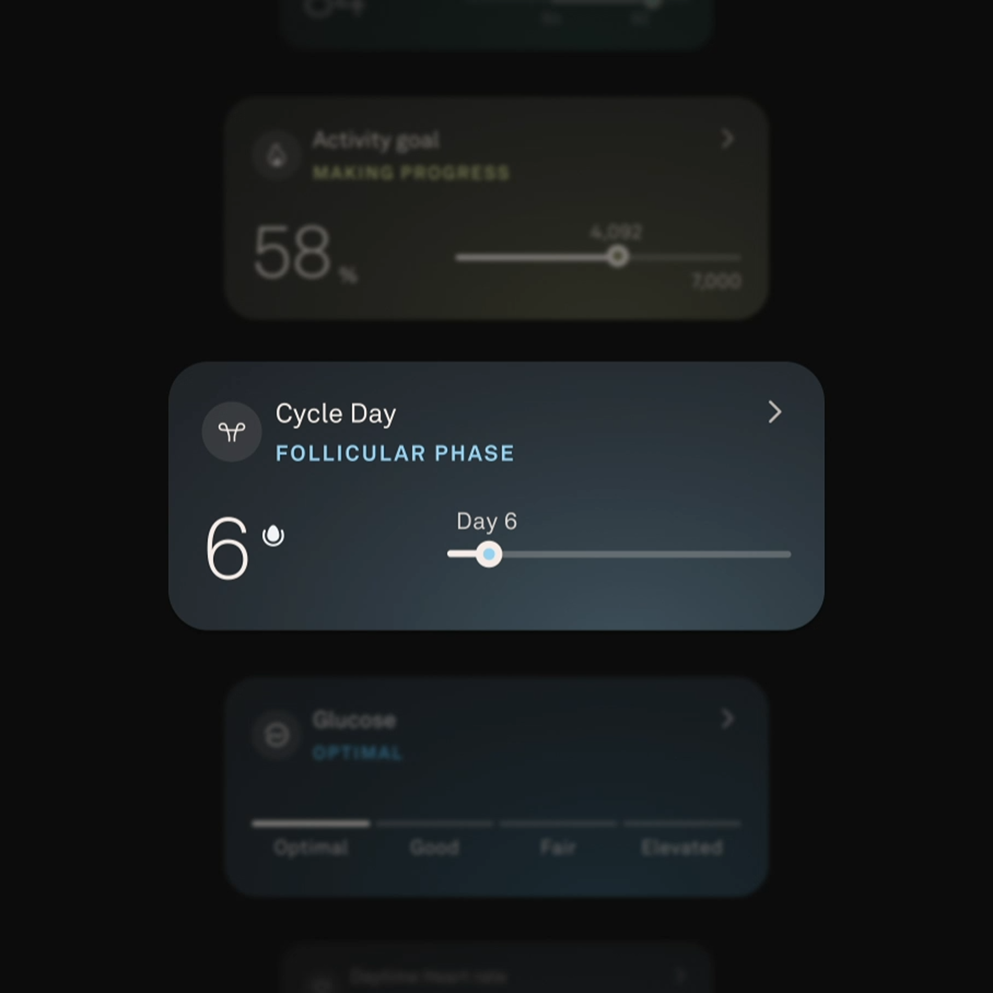
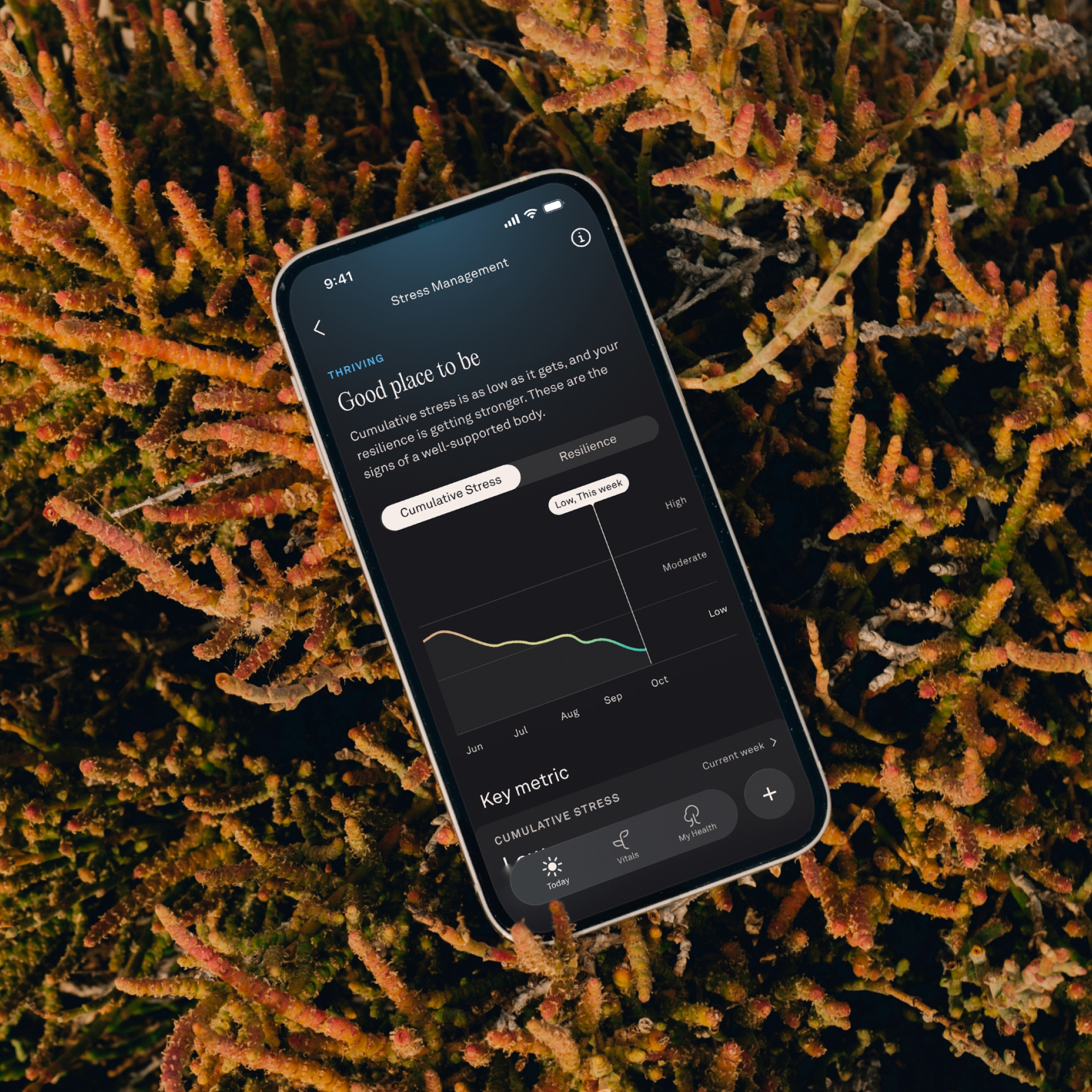
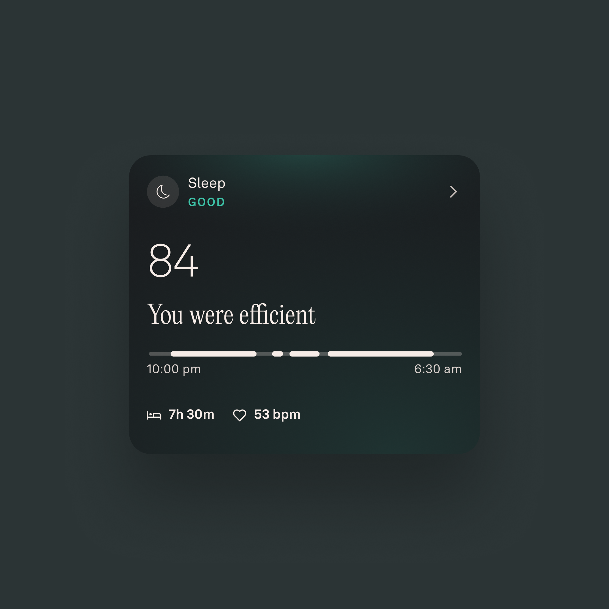
Instrument collaborated with Oura to create a more intuitive app that helps millions of members make sense of daily signals and long-term health trends. The Challenge As Oura expanded beyond sleep into a holistic health platform, the app began to outgrow its own success. Members were generating more meaningful data than ever—daily signals, long-term trends, personalized guidance—but the experience struggled to clearly surface what mattered now versus what mattered over time. Valuable insights were buried beneath growing complexity, making it harder for members to interpret their health, build habits, and stay engaged. How might the Oura app evolve to clarify complexity without oversimplifying the science behind it? Clarity through progressive meaning We reimagined the Oura app around a single principle: progressive disclosure of meaning, revealing the right level of insight at the right moment, while preserving depth for those who want to go further. By pairing a scalable visualization framework with a unified semantic color language, we transformed dense health data into an experience that feels intuitive, emotionally resonant, and actionable, helping members understand today’s signals while connecting them to long-term health outcomes. Designing for moments, not metrics We balanced utility and expression to strengthen comprehension while elevating Oura's emotional connection with its members. The redesign introduces a clear hierarchy that prioritizes daily relevance, supports pattern recognition, and encourages exploration without overwhelming the user. The result is an app that feels lighter, faster, and more human, even as its underlying intelligence grows more sophisticated. Evolved Visual Identity Building on Oura's existing brand, we created a refined visual language that brings greater clarity, warmth, and cohesion across the product. Refined typography, grid systems, and simplified components improve scanability and reinforce trust—ensuring the interface feels calm, considered, and grounded in science. A semantic color system for instant clarity To help members quickly understand how their behaviors support or strain their health, we introduced a unified semantic color system across the app. Color is no longer decorative; it’s instructional. Dynamic cues guide attention, support comparison, and make insights immediately legible across contexts. Members can now recognize patterns at a glance and confidently act on what they see. A scalable data visualization framework We rebuilt Oura's visualizations across three adaptable layers: — At-a-glance signals: Abstract rings, bars, and color cues deliver fast daily insights. — Focused metrics: Mid-level views add context for short-term patterns and key vitals without cognitive overload. — Deep exploration: Detailed, often interactive views reveal long-term trends across weeks, months, or years. This system allows members to move seamlessly between intuition and precision, supporting both quick check-ins and deeper understanding. The Impact The redesigned app makes Oura's health insights clearer, more actionable, and more engaging, helping members understand what’s happening today and how their habits shape their long-term health. For Oura, the unified visual language and scalable architecture create a future-ready foundation that accelerates feature development, reduces complexity, and keeps the experience cohesive as the platform continues to evolve. From Doug Sweeny, CMO of OURA: The clean new design keeps everything you love about Oura, but adds more clarity and simplified intuitive navigation. The My Health tab allows you to understand your specific health strengths and opportunities at a glance, while seeing how your habits tie into the bigger picture of your long-term health.