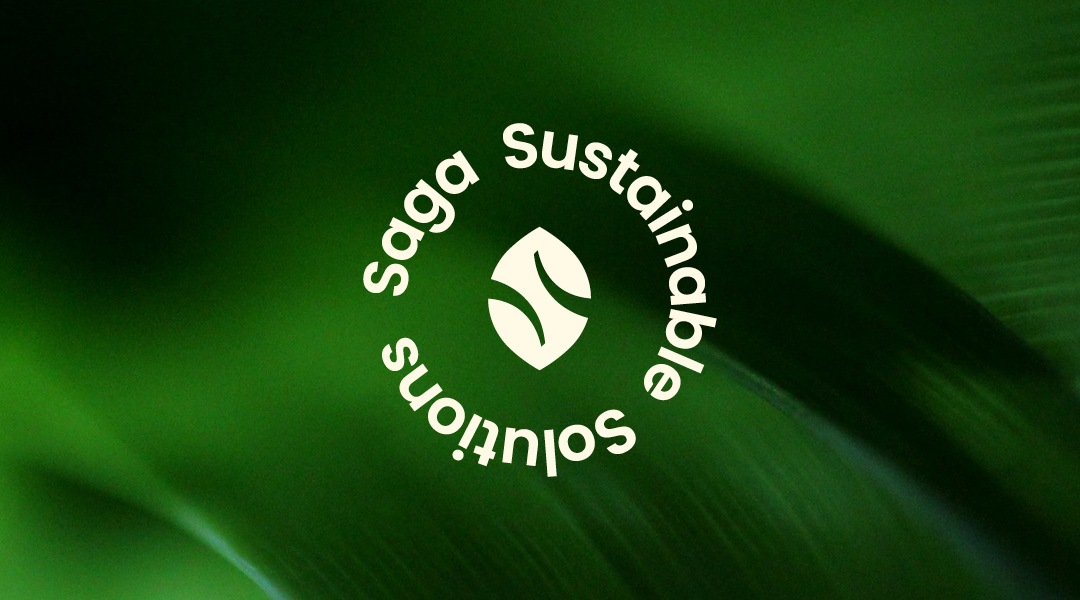
Saga Sustainable Solution is a new eco-focused brand rooted in sustainability and circular thinking. Aimed at U.S. consumers beginning to explore environmental responsibility, it builds an approachable identity with global relevance.
The logo blends a natural leaf and the letter "S" into a symmetrical symbol of renewal and balance between humans and nature. Its palette—beige, forest green, fresh green, and brown—evokes calm, warmth, and grounded energy. Rounded sans-serif typography adds friendliness and clarity.
Key visuals include pseudo-3D illustrations of Saga’s paper containers, adding character and distinction. The website continues this style with custom illustrations and warm, animated interactions to create trust and connection.
This rebrand provides Saga with a clear, emotionally engaging identity that links ecological values with modern aesthetics, offering a solid foundation for growth in the global sustainability market.