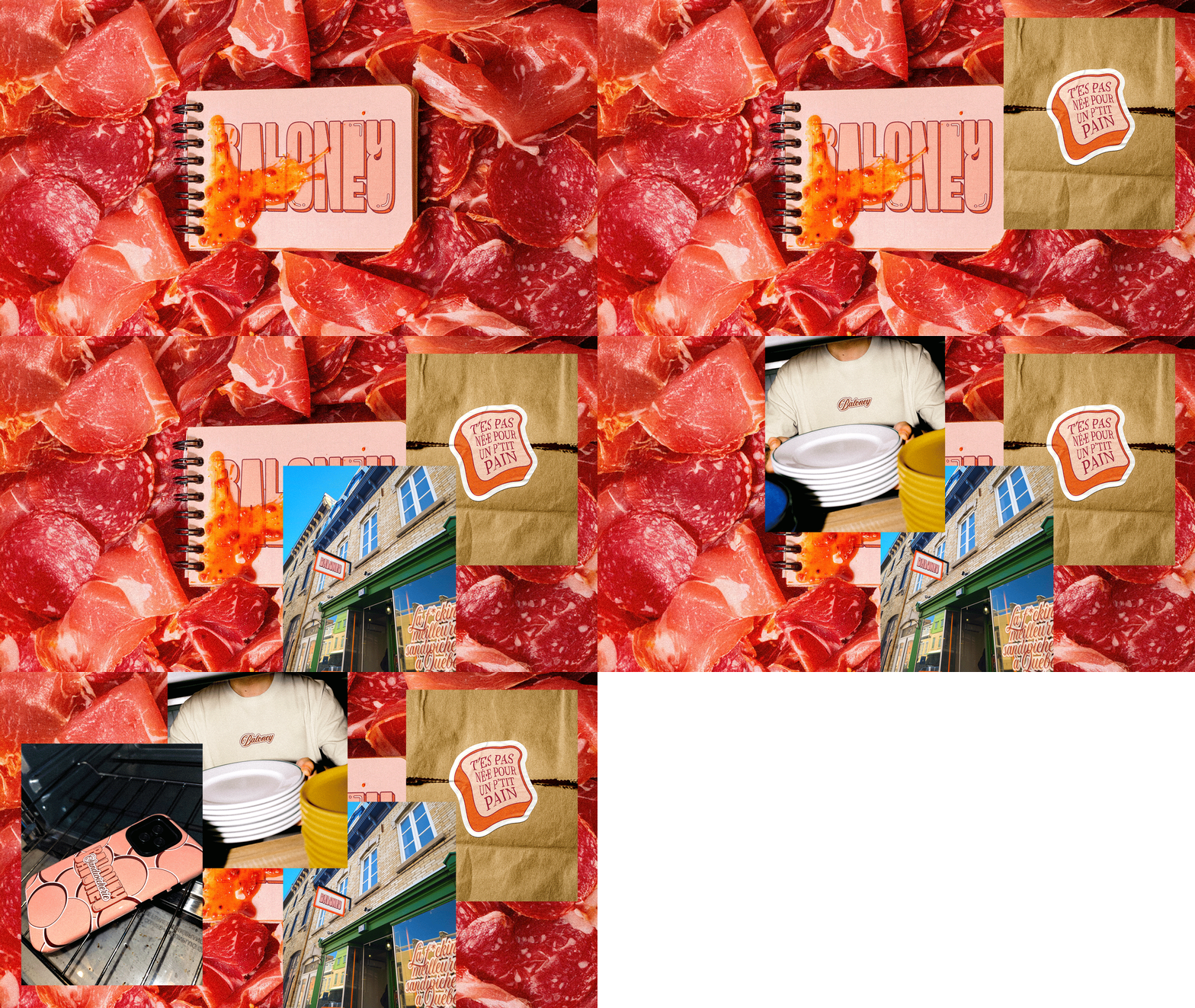
Baloney (French translation to bologna) is a new sandwich shop in Quebec City reimagining a humble classic with bold ambition.
Recreation built the brand around a sharp strategic axis, the "Diamond Baloney" concept, playing on the contrast between an everyday classic, a high-end execution, and its polarizing name.
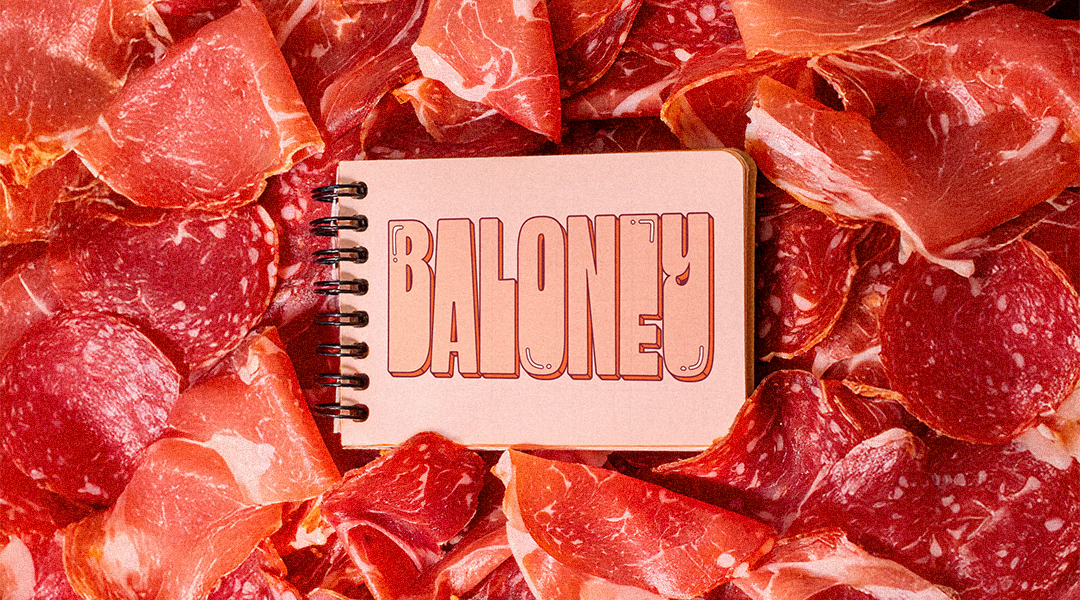
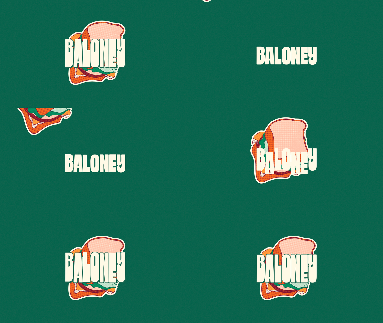
The identity begins with a carefully customized typography. Its shadow evokes a freshly sliced piece of bologna, while the chunky letterforms reference the thick bread. The logo lives in both a classic version and a "greasy" one, as if generously buttered.
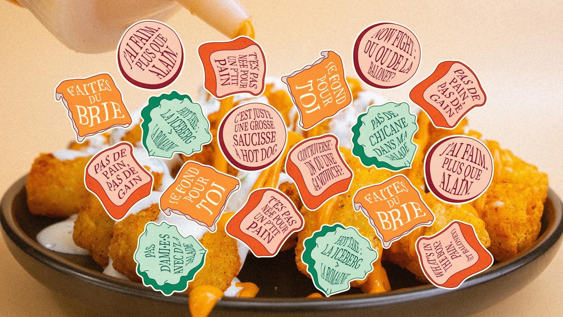
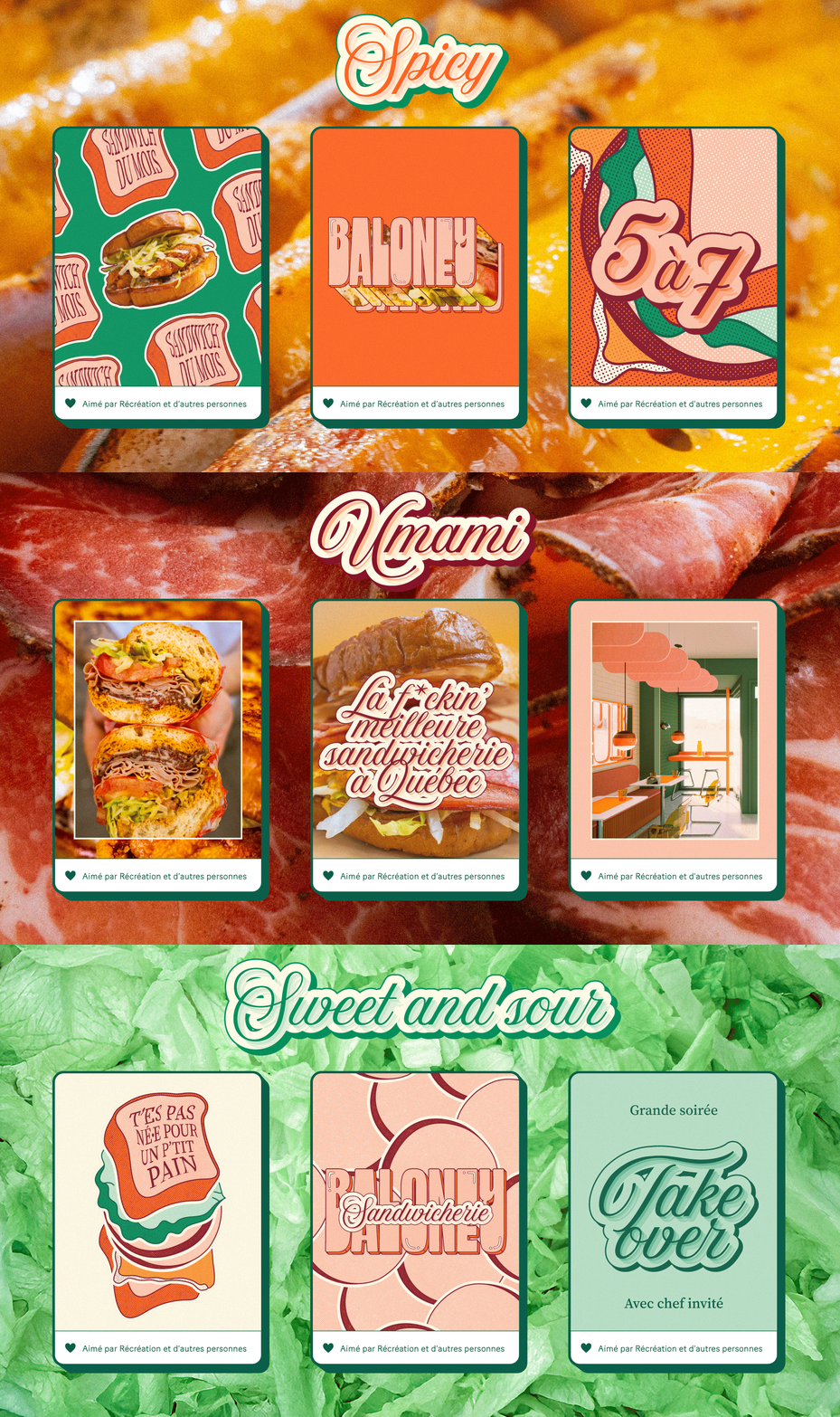
Designed with a social-first mindset, the brand celebrates generosity through a playful, straightforward tone that sparks immediate emotional connection. Content draws on food culture, pop references, and local Quebec flair to drive engagement.
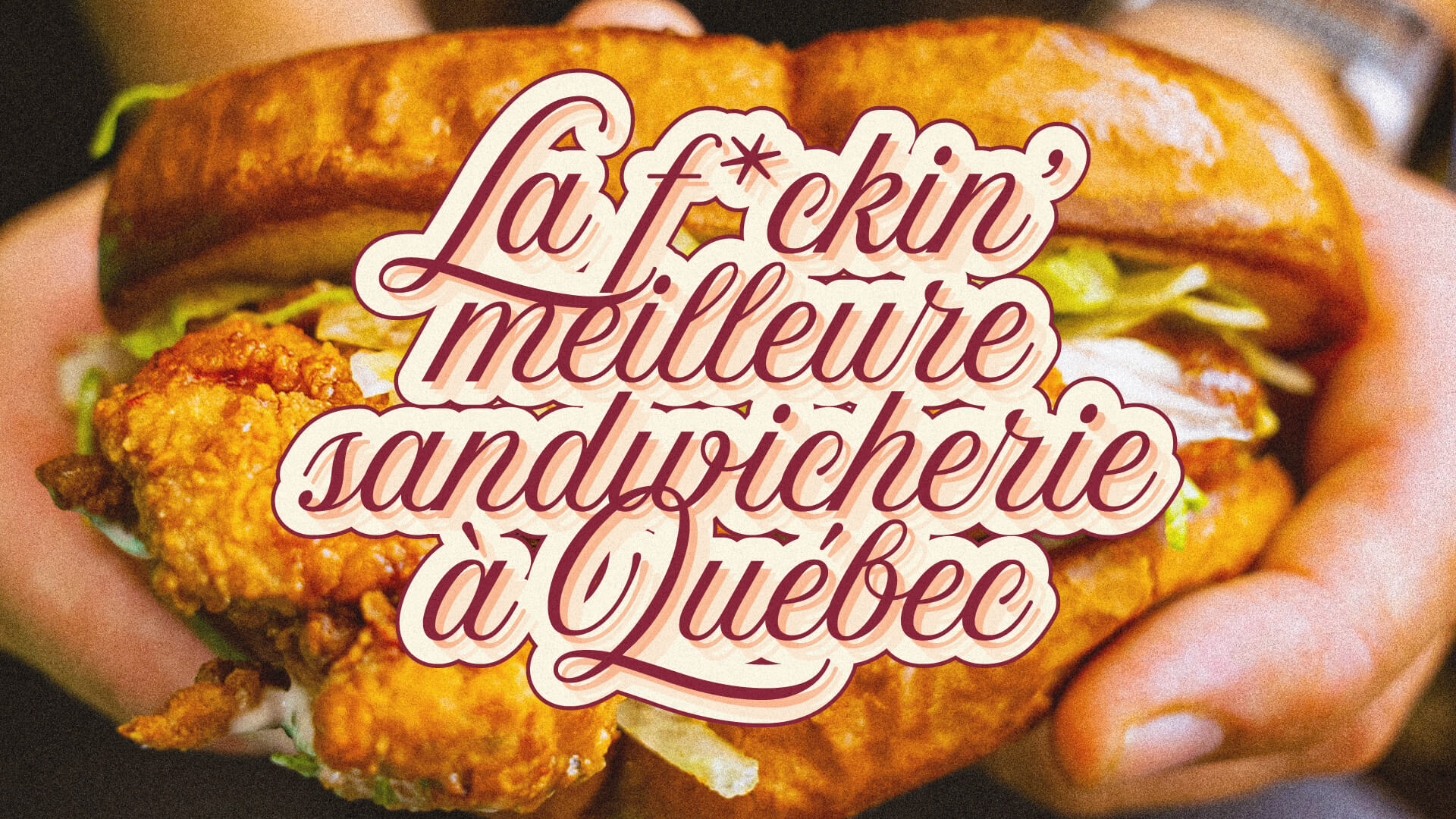
The typographic system also allows for a more refined expression, combining shadows and outlines inspired by the logo. This creates a look that feels fancy without taking itself too seriously, staying true to the core concept.
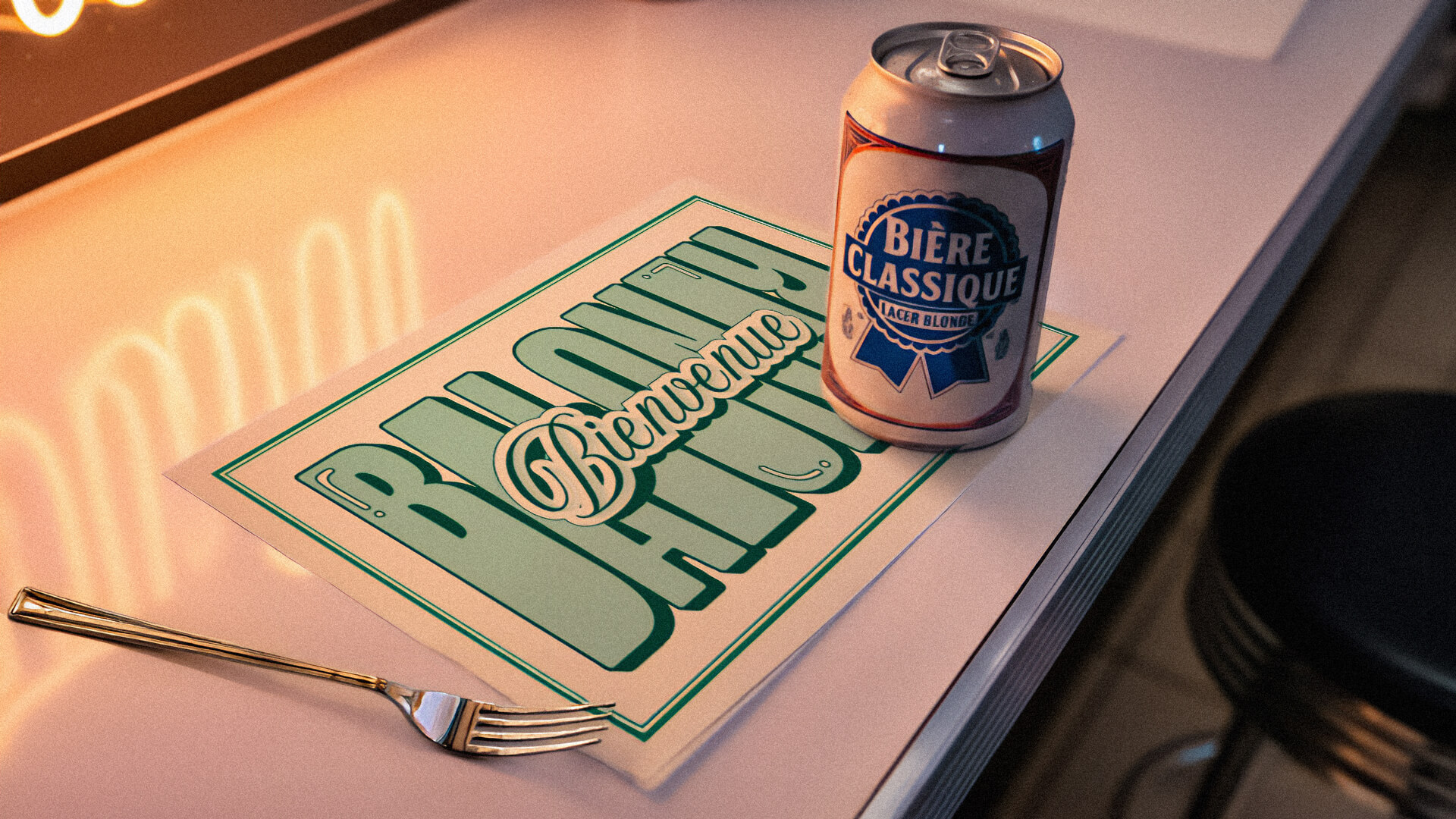
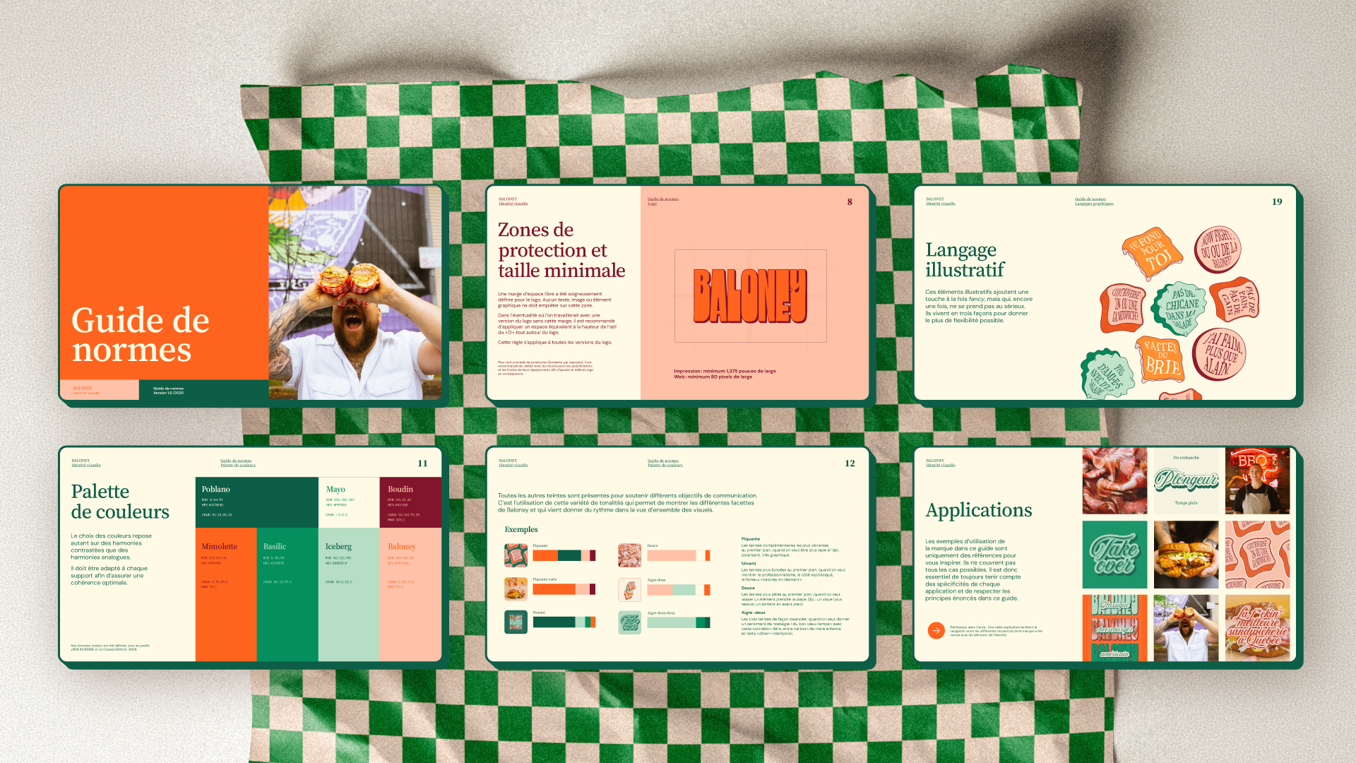
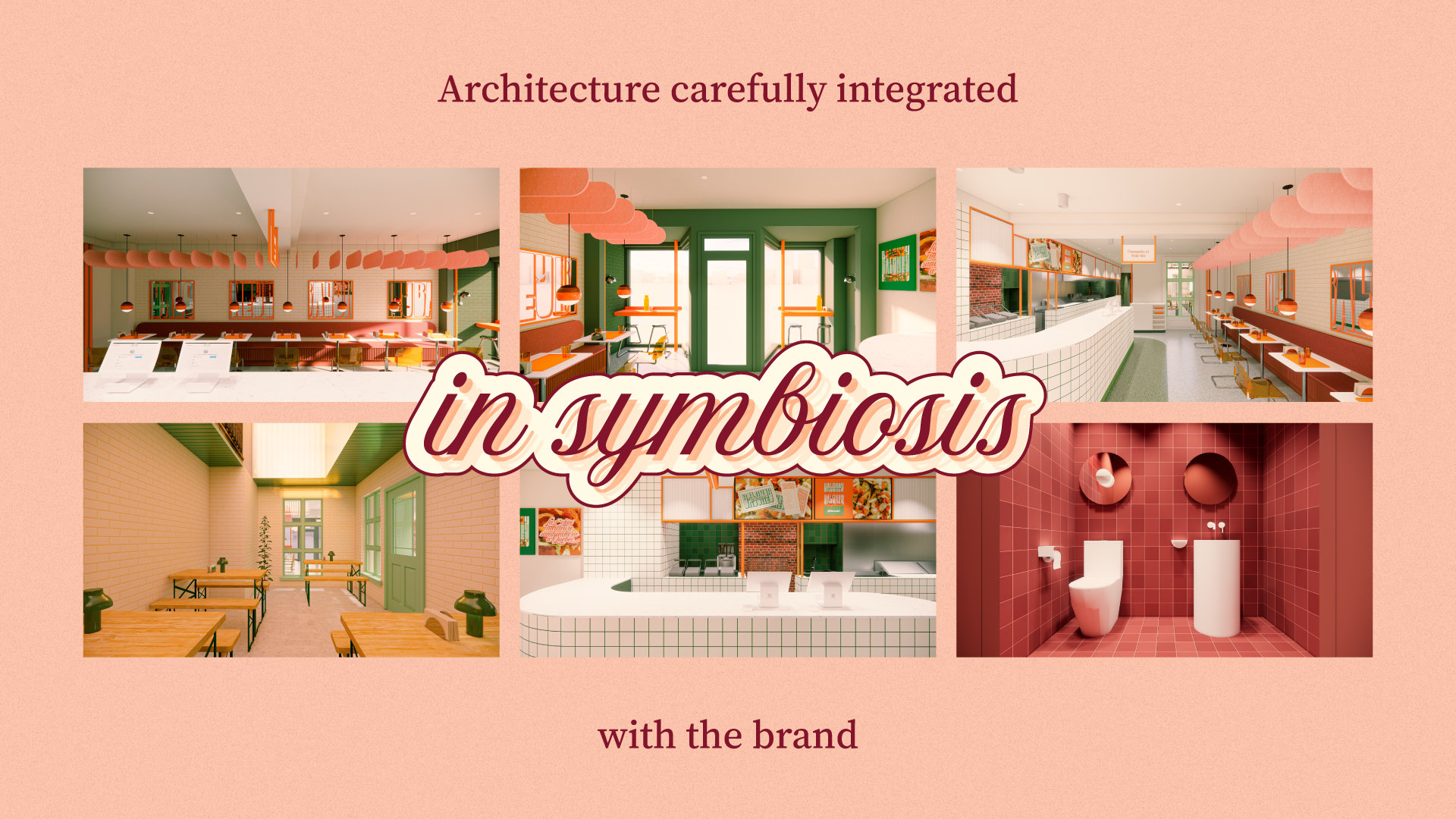
Modular and versatile, the graphic language adapts to multiple moods, from bold and vibrant to rich and nostalgic diner-inspired. Even before opening, Baloney generated strong buzz, becoming not just a restaurant but a complete, immersive brand universe, and is now proudly recognized, as the slogan boldly states, as the f*ckin’ best sandwich shop in Quebec City.