For over 25 years, Checkatrade has helped homeowners, landlords and renters find verified and reviewed tradespeople, originally through printed directories delivered door to door. But in a digital-first world, the legacy Checkatrade identity no longer reflected the brand's ambition or the digital experience it needed to deliver.
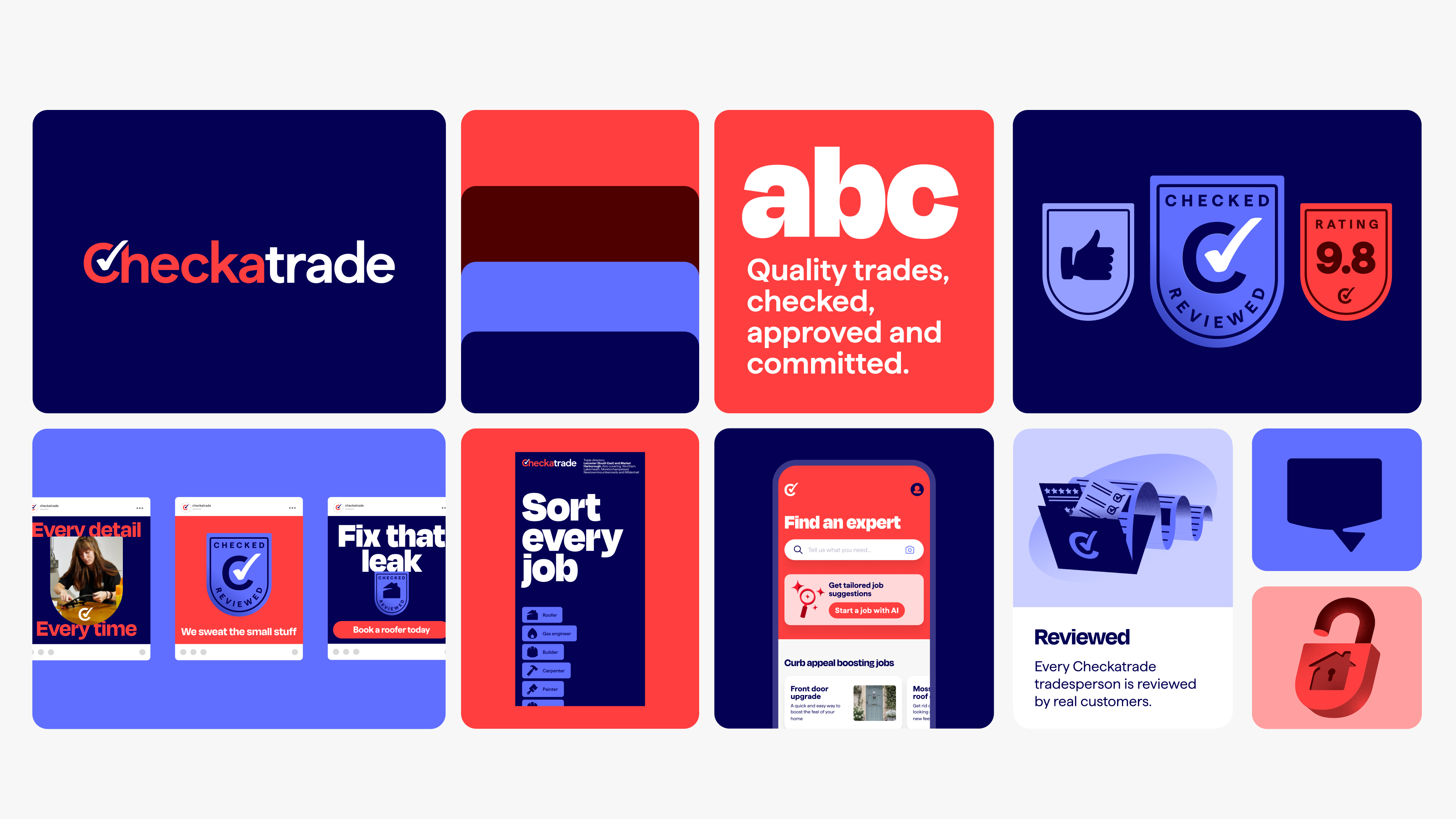
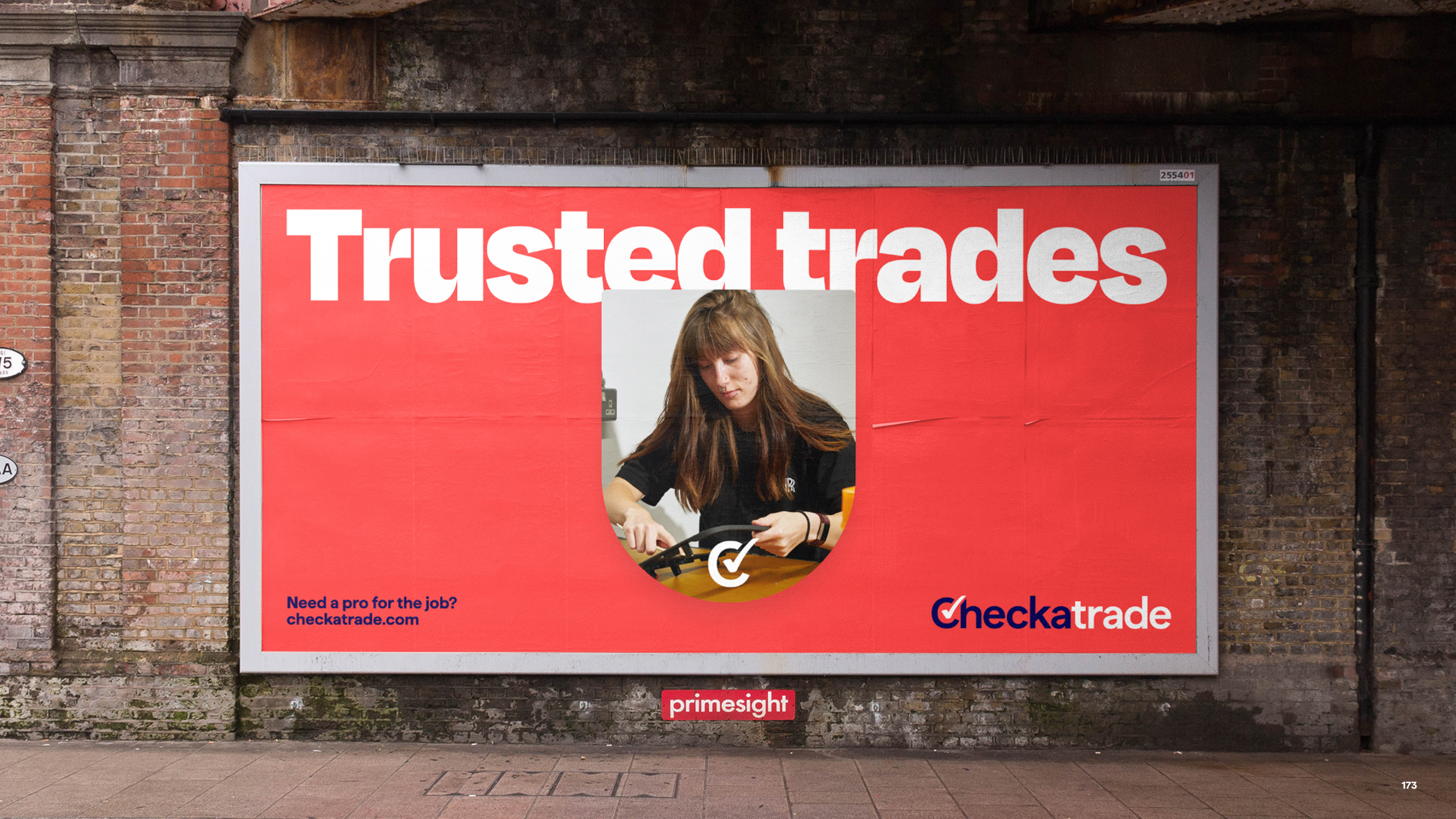
As Checkatrade evolved into a fully integrated marketplace and app, M+C Saatchi Consulting was engaged to reimagine the brand for its next chapter. What emerged is a brighter, bolder and more contemporary identity, designed for a digital-first future.
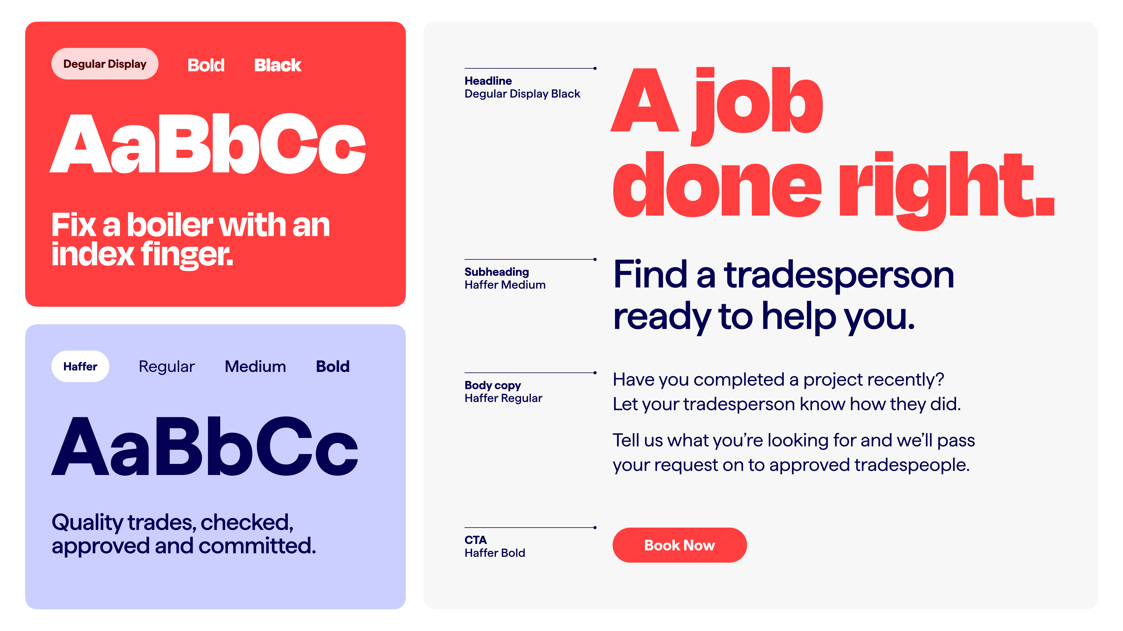
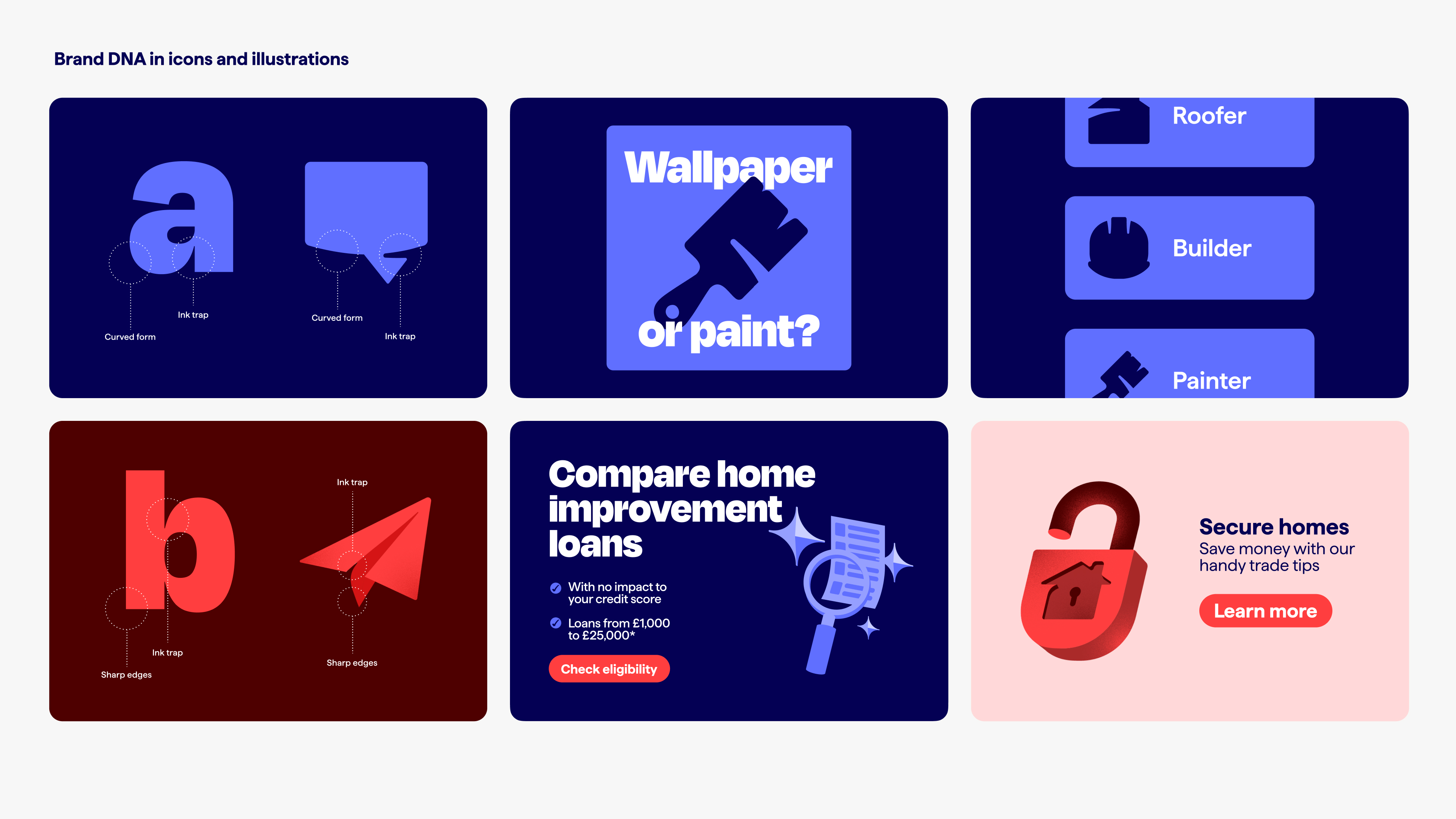
The refreshed colour palette evolves Checkatrade's heritage tones, introducing a warmer red that balances confidence with approachability alongside a deeper blue that builds trust and strengthens accessible contrast. A considered typographic system balances personality and performance, pairing the characterful Degular for expressive headlines with the highly legible Haffer to ensure clarity in-app.
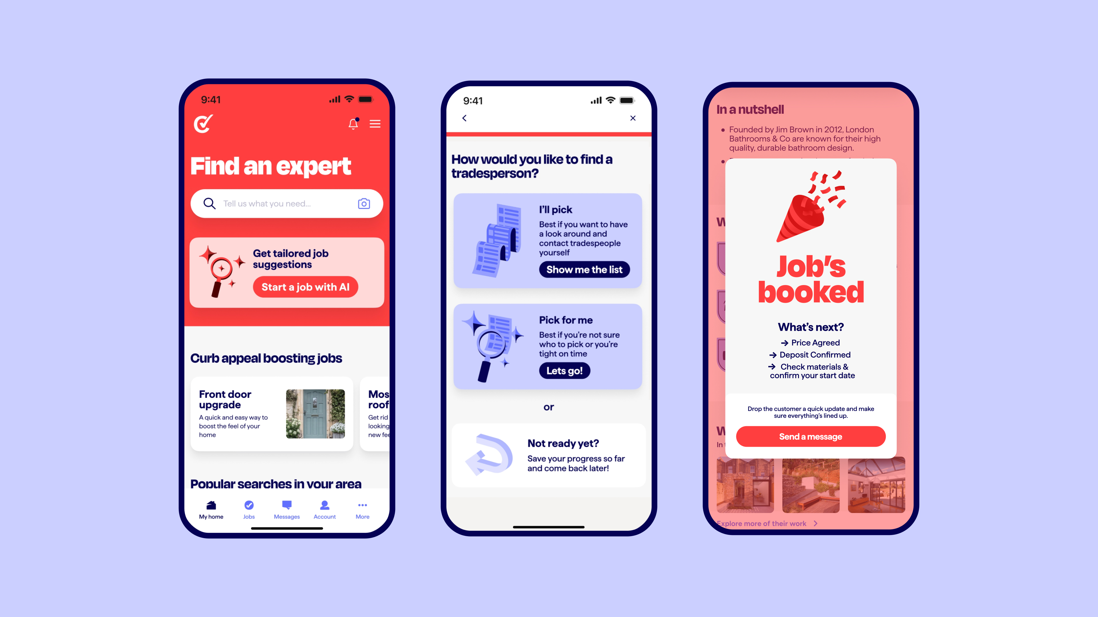
Recognising that finding and hiring a tradesperson for home improvement can feel daunting, illustration and motion were crafted to reduce friction and build confidence — with purposeful micro-interactions and snappy transitions that signal speed, progress and reassurance. A modern interface system, layered with subtle depth and shadow, reflects the physical nature of making improvements.
The result is a distinctive, scalable brand system that positions Checkatrade as the home of home improvement.