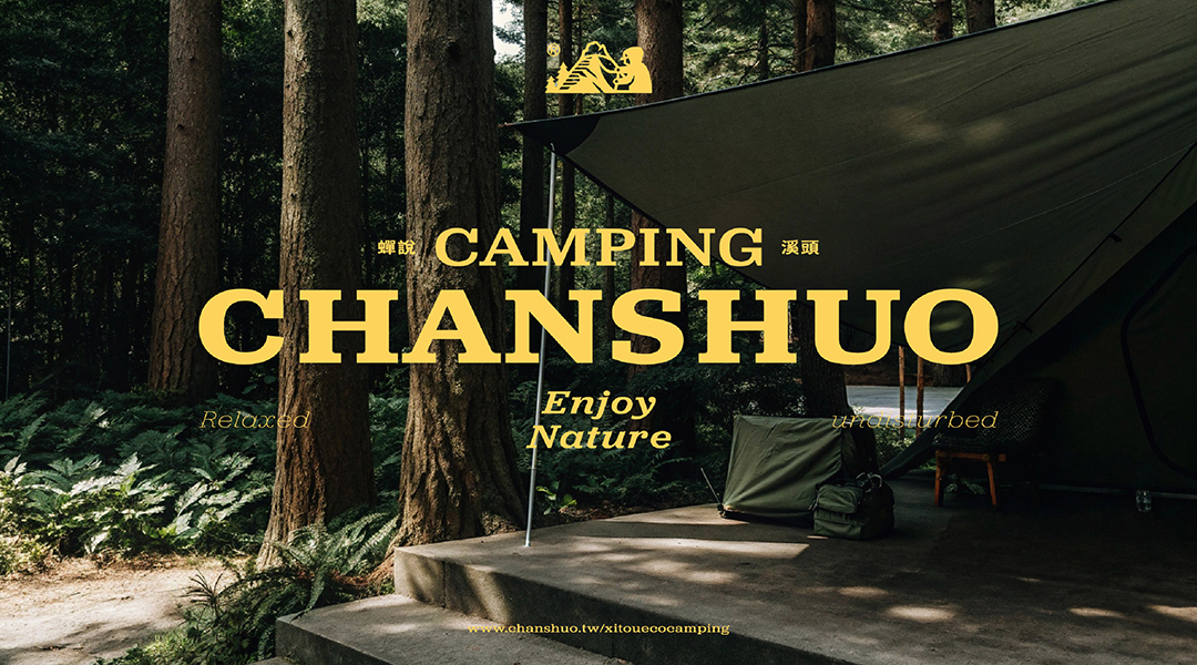
"Chanshuo: Xitou Ecocamping" is a campsite nestled in the Xitou Ecological Area in Taiwan. Recognizing that most self-pitch campsites in Taiwan lack brand identity, this project aims to create a distinctive and competitive brand grounded in the spirit of "easy to start, fall in love with camping."
The logo design fuses the imagery of mountains and tents, with a hoodie-wearing camper lifting the tent flap-symbolizing discovery, curiosity, and the joy of nature. The storytelling element adds personality, inviting users to imagine themselves as part of the experience.
Typography combines bold sans-serif Chinese characters with serif English letters, reflecting a rugged yet refined outdoor style. A primary forest green palette symbolizes land and nature, while yellow and beige provide warmth and high visibility within outdoor settings.
To enrich the experience, we developed woodcut-style illustrations with detailed textures, enhancing the brand's "return to nature" ethos. A treasure map-inspired guide invites campers to see the site as a space of exploration and adventure.
This branding project elevates Chanshuo beyond function-bringing a clear visual identity and cultural value to Taiwan's camping scene and encouraging more people to enjoy the beauty of tent life.