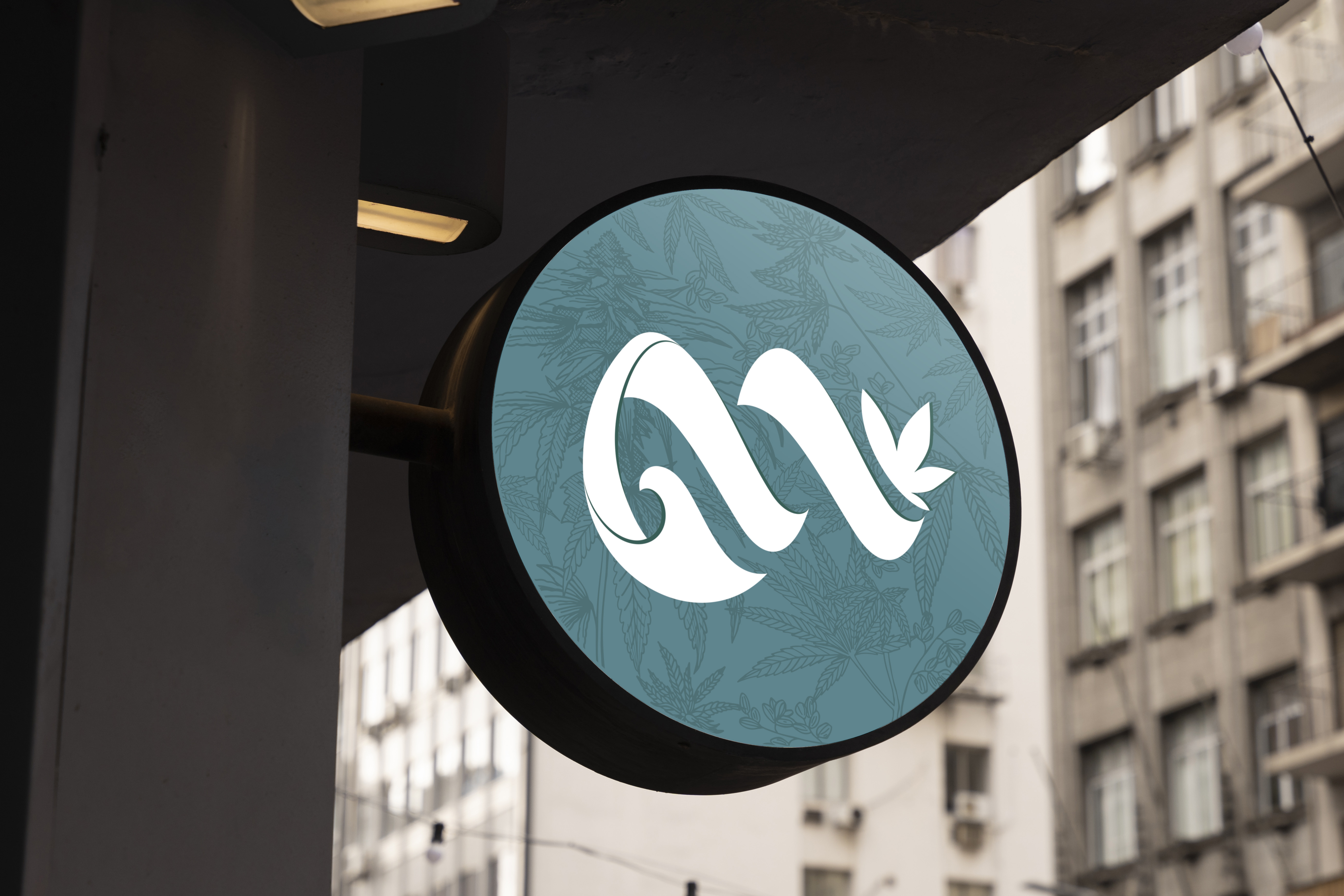
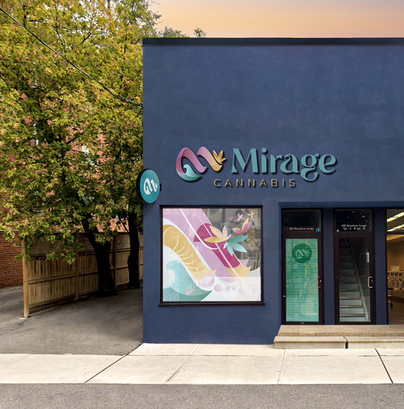
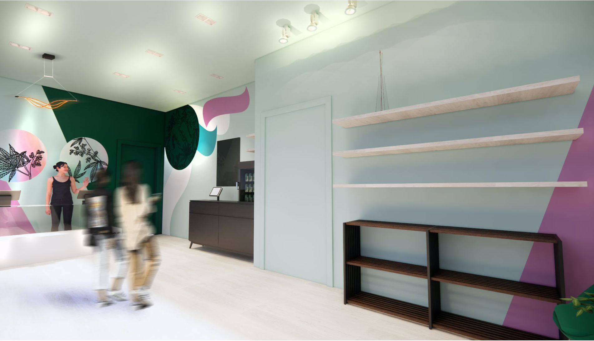
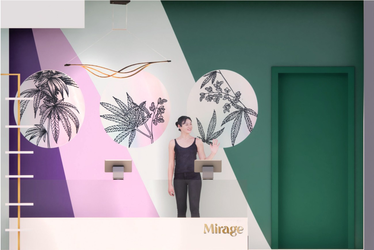
Mirage Cannabis is a brand that aims to bring magic and relaxation to people's everyday lives through the use of organic, hand-picked, safe cannabis products. The brand identity includes a unique logo with a wave-like flow that touches on the customer experience in the retail space and suggests smoke plumes through abstract shapes. The logo symbol forms an "m" with an uplift at the end, leading to a non-typical cannabis leaf symbol. The wordmark is set in an elegant, transitional serif font, with a smoke-like letter space and unique characters that give it a creative and unexpected persona.
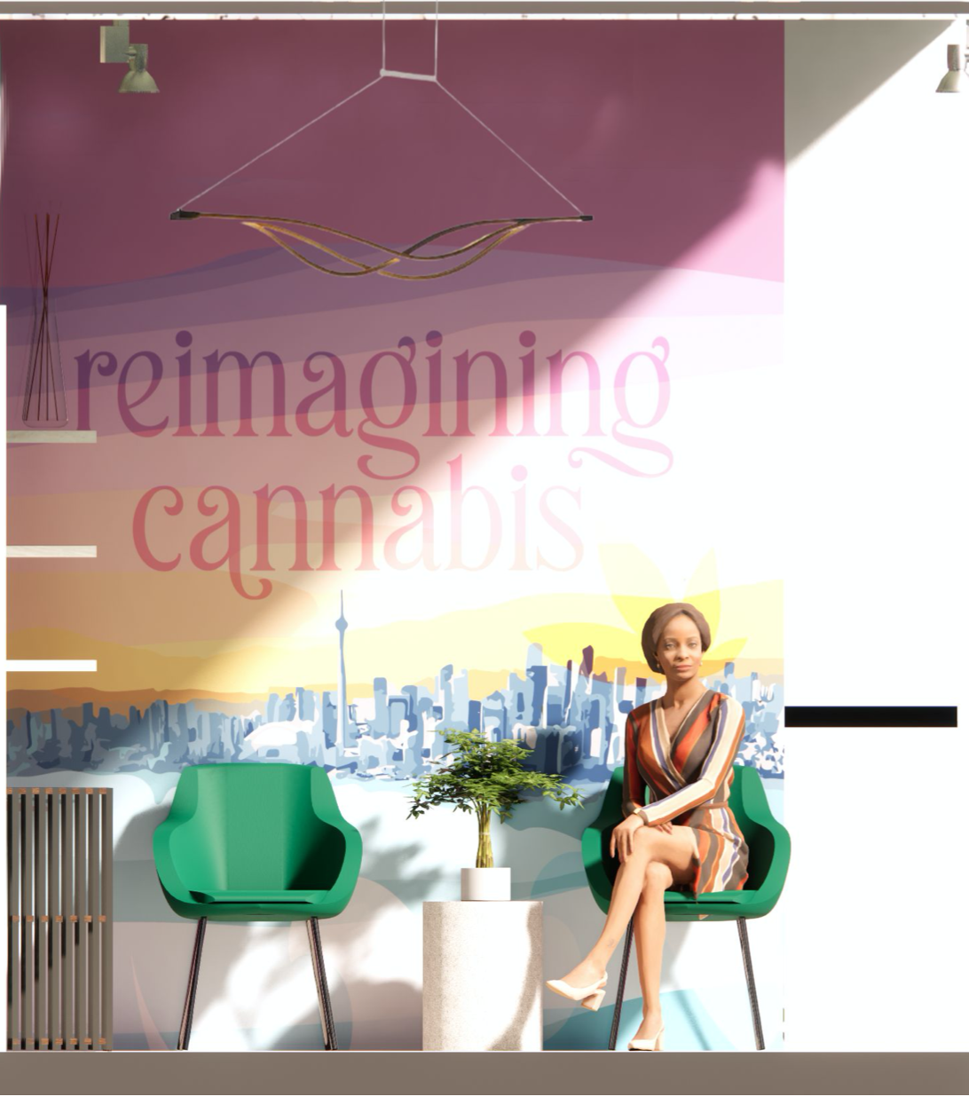
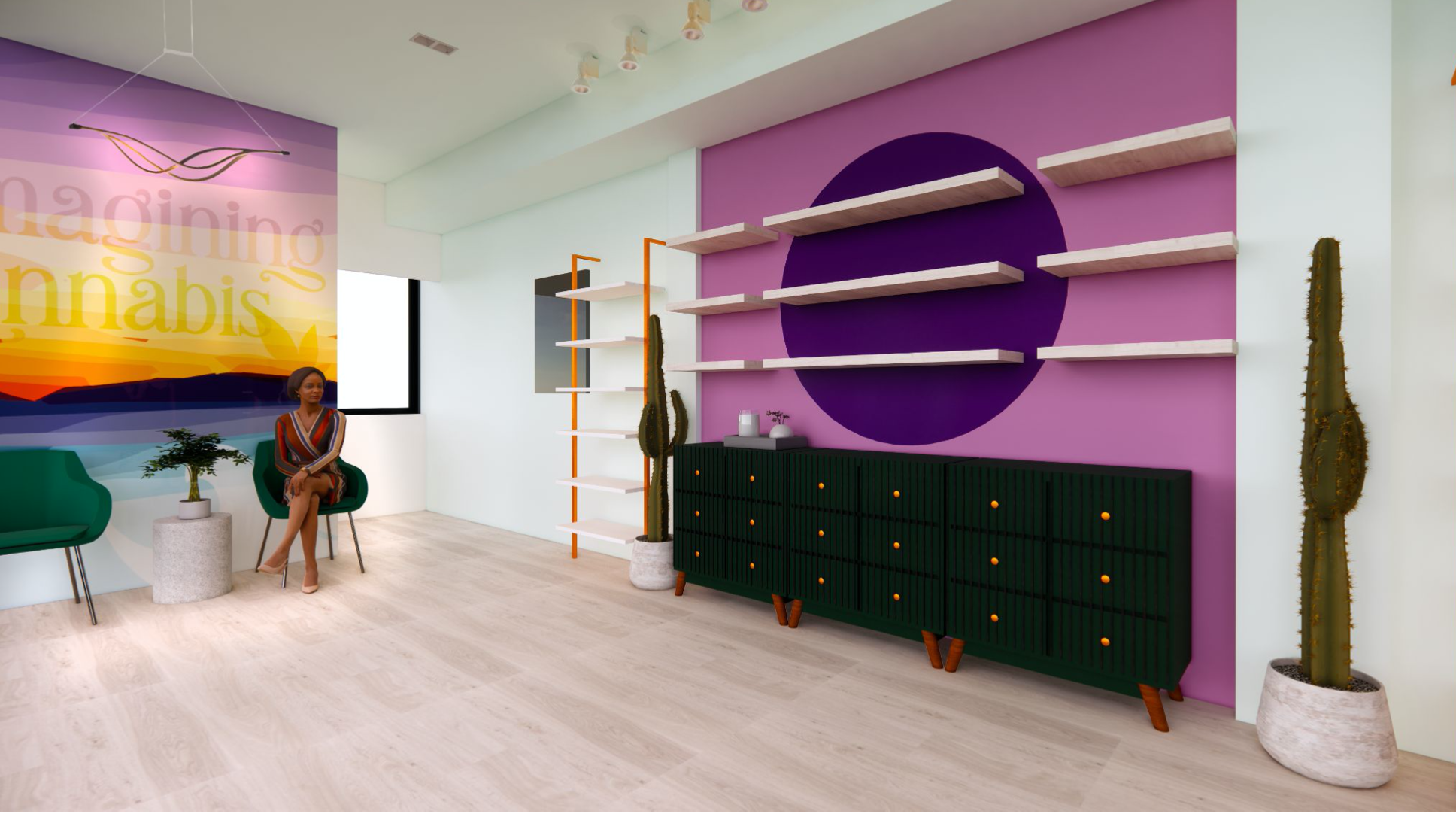
The brand’s unique colour palette and art draws people in and is inspired by the purple budding of cannabis - like a mirage or oasis in the middle of a desert. The store's design also includes an on-brand window vinyl art piece, a statement tagline piece in the lounge area, and environmental graphics at the check-out area. Hand-in-hand the brand and retail space aim to inspire, intrigue and bring an oasis to the customers by "Reimagining Cannabis."
Interiors and Renders by Black Bloom Studio.