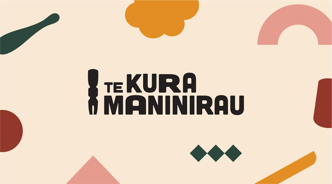
Te Kura Maninirau is Aotearoa New Zealand's first indigenous circus school, developed by two charitable trusts - Te Pou Theatre Auckland's most established circus studio. The school creates learning pathways for indigenous Maaori youth into the circus art form.
Te Kura Maninirau came to us needing a partner to help create a visual identity that reflected their programme in a contemporary and joyful way, that would appeal to children. It also needed to reflect the physicality of the school's activities.
Working closely with them we chose a colour palette that veered away from the primary colours usually associated with circus. We took inspiration from tae whenua (earth tones) such as kokowai, the red ochre clay found in volcanic areas of Aotearoa; kerewhenua, yellow clay used as a traditional dye in various fibre arts; papakura, pink earth, named after the red glow present in Te Tahu Nui aa-Rangi (the southern lights); and pounamu the precious greenstone prized by all of Aotearoa.
The long tradition of Maaori arts gave us the perfect foundation to build from.
The logo is inspired by karetao, Maaori puppetry, linking to the traditional activities performed in Te Whare Maatoro - the house of entertainment for young people in pre-settler times. This is firstly to acknowledge the links to Te Pou Theatre and secondly, Maaori practices used to entertain young people.
A suite of shapes adds to the visual identity. Within this, some resemble artefacts such as the patu (a traditional club, which can also be interpreted as circus juggling pins), the toki (axe) and a waka (canoe). The series of diamonds refers to the Maaori pastime of whai (string games). The kapua (cloud) element is inspired by the traditional name for New Zealand - Aotearoa - the land of the long white cloud; Te Raa, the semi-circle shape, is inspired by the sun. Together they express the strength and perseverance required to learn and perform the activities in Te Kura Maninirau.
The triangular shape connects to the maihi (carved barge boards) represented in the Te Pou Theatre logo; while the Uenuku (rainbow) shape is a subtle reference to the Dust Palace logo of an umbrella, representing the proverbial rainbow after the storm.
All of these assets were developed for the client to continue to use across comms and design assets themselves, giving them plenty of scope to continue to develop a playful, powerful and on-brand visual identity.
A successful launch has resulted in the Te Kura Maninirau programme becoming fully booked, with a long waitlist for their classes.