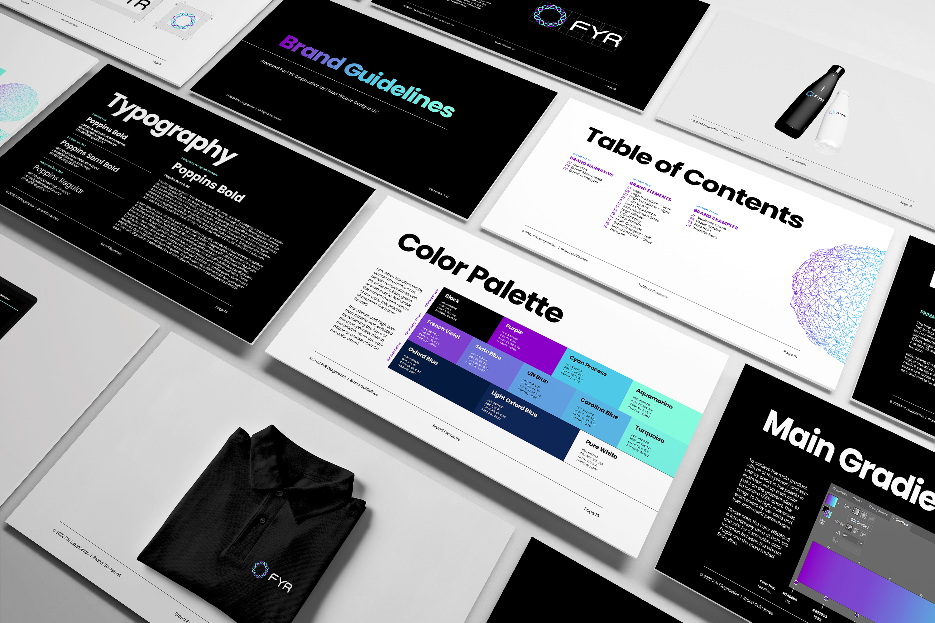
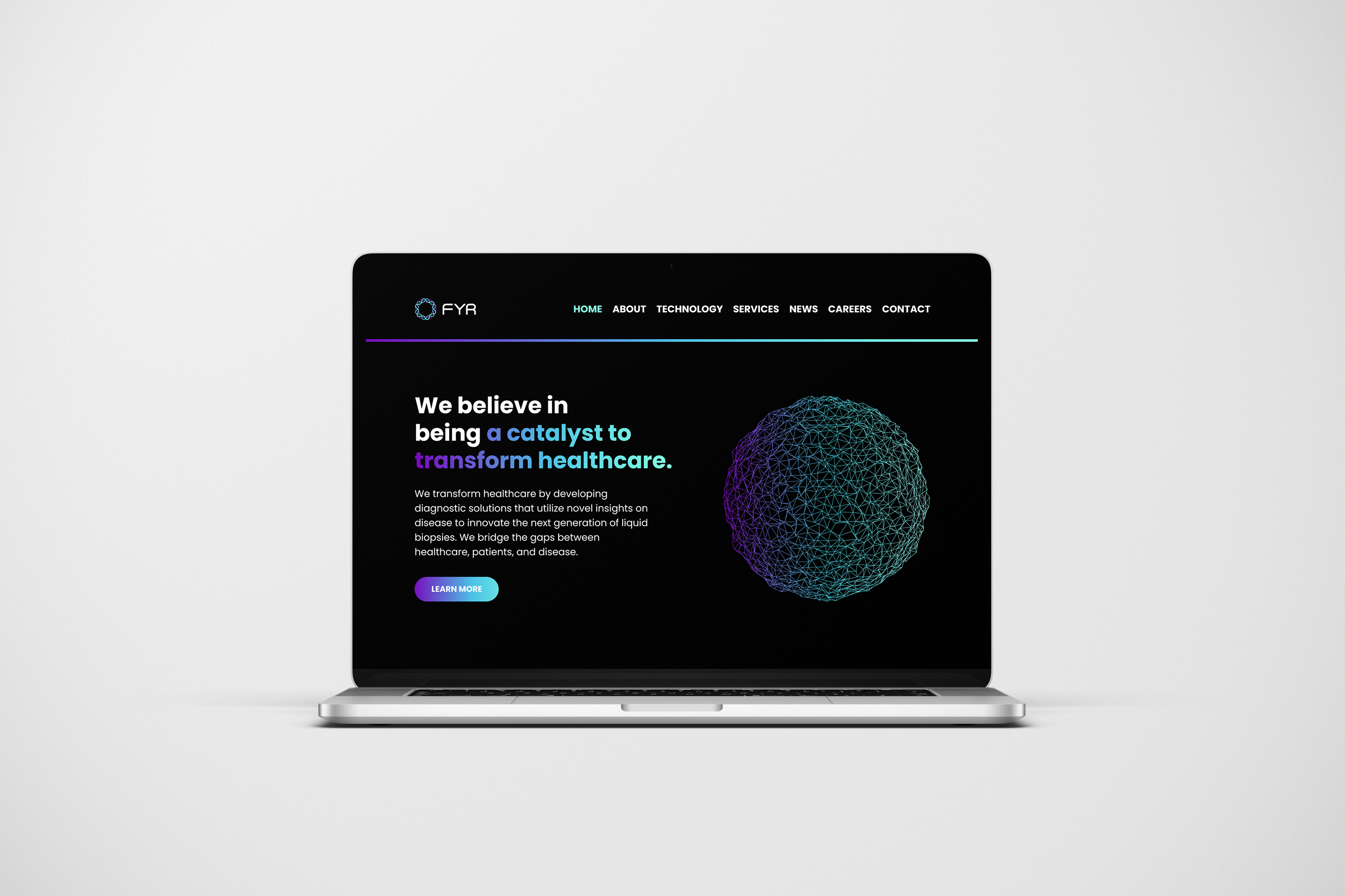
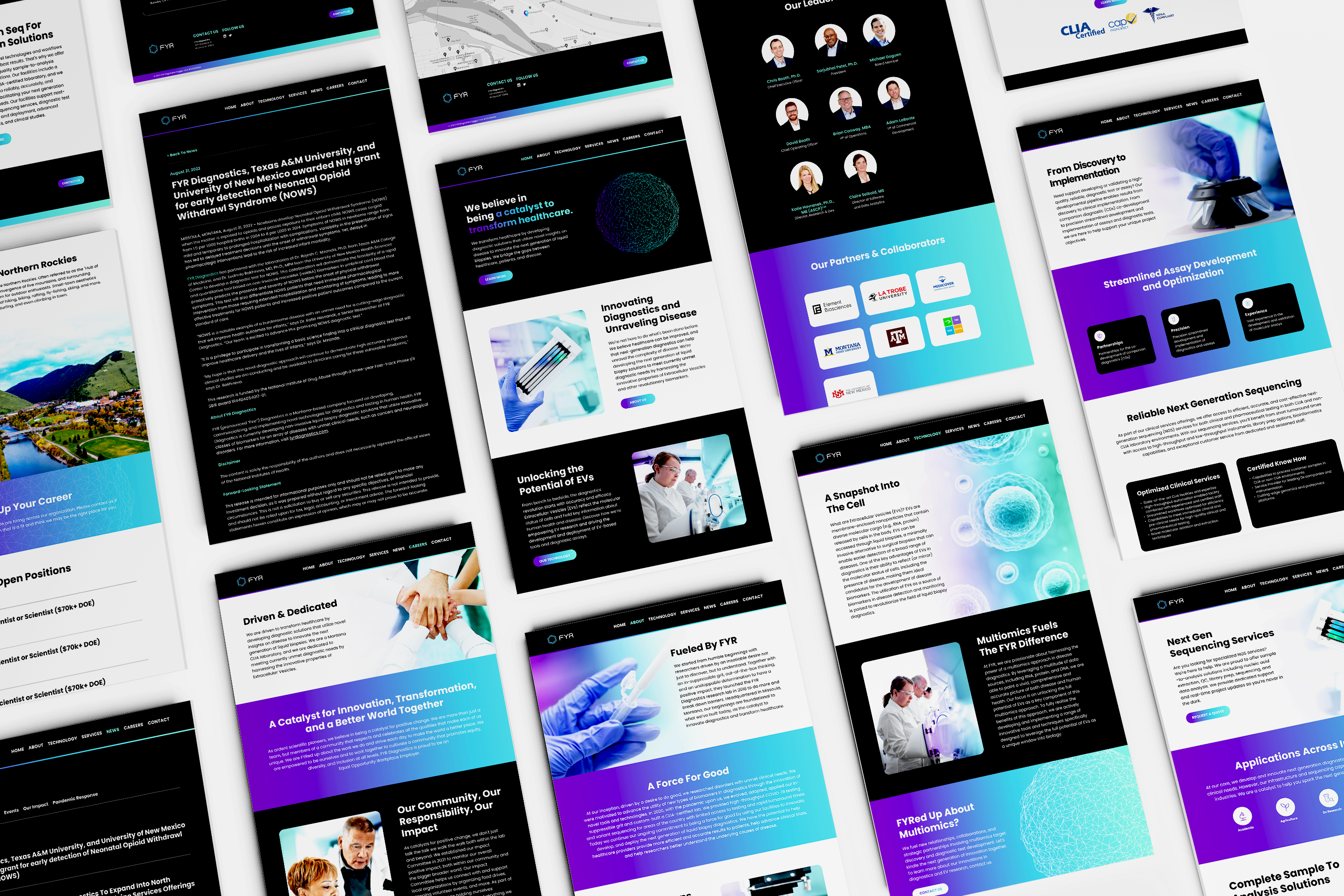
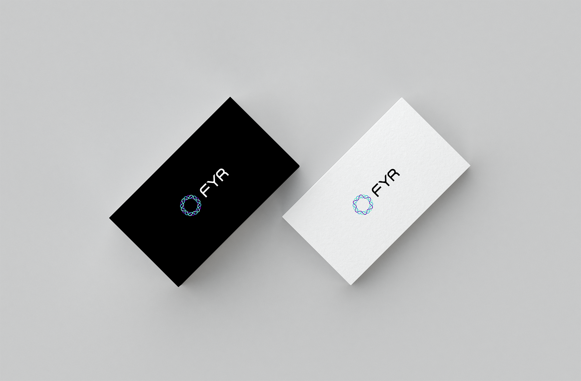
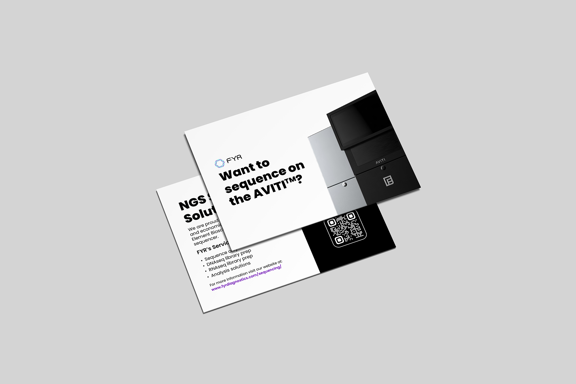
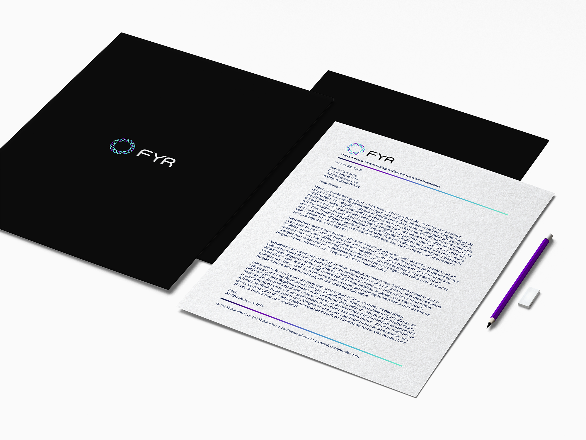
FYR approached me for a brand identity system, a full suite of collateral, and an enhanced website that reflects its evolution. I created a scintillating brand to differentiate them from their competitors, ignite enhanced interest from investors, spark engagement from customers, and enkindle buy-in.
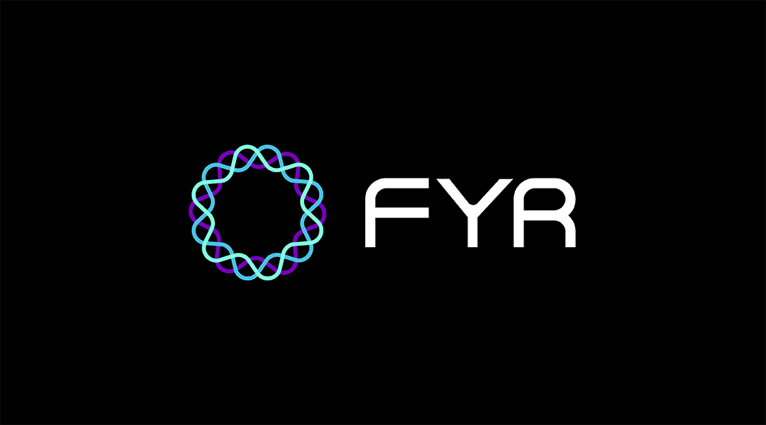
The goal was to transform FYR's brand into a sleek, modern, and clean biotech brand ahead of its Series A raise. FYR approved the most transformative, bold, and defiant option. The hot and cold color palette was the deciding factor. The palette represents fire transformed as it can be white-hot, green, blue, or even purple. The logo icon was inspired by the cross-section of an exosome, the lipid bilayer, and ribbons of RNA and mRNA -- by the core of what they do. The tri-color approach to the icon disrupts the status quo of FYR's industry. The wordmark features both round and sharp corners to symbolize the fluidity of fire and liquid as well as the rigidity of FYR's resolve to innovate diagnostics and transform healthcare for patients.