REBRANDING FOOD PRODUCER
Farmer Brand, an established Singapore-based food producer with a rich legacy spanning over five decades under Mei Heong Yuen Food Industries Pte Ltd, unveils a comprehensive rebranding initiative.
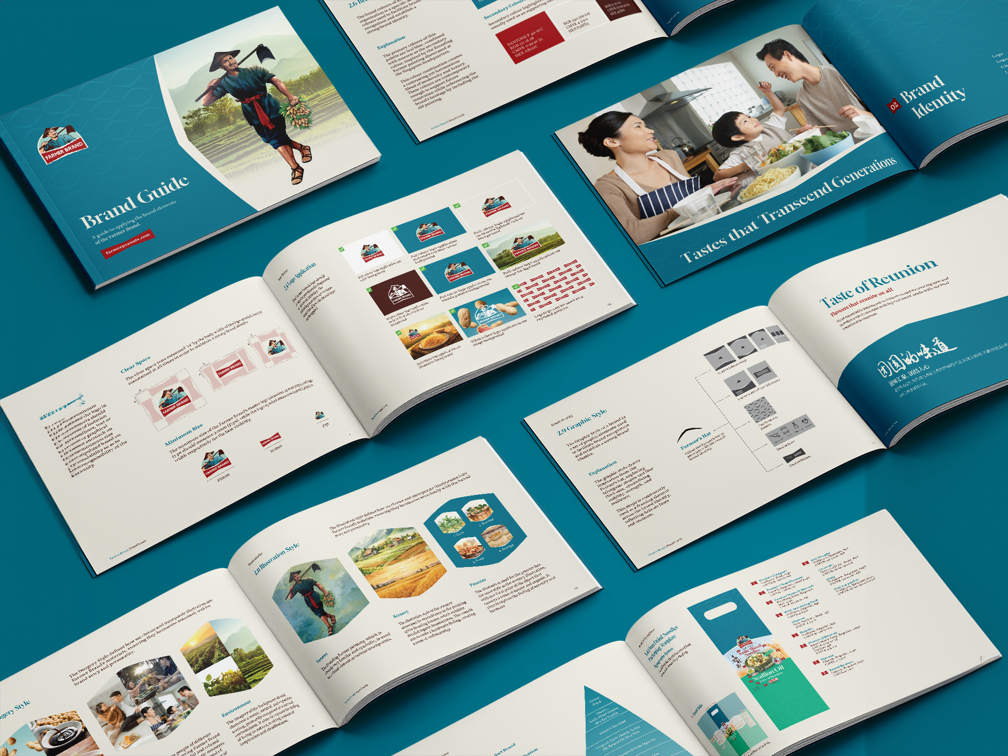
Striking a harmonious balance between functionality and symbolism, the brand's logo, featuring the founder in a poignant sunset return, encapsulates its enduring commitment within a semicircle, symbolizing its extensive industry history. The refined logotype, elegantly arranged in a ribbon shape, is a testament to the brand's unwavering dedication to quality and customer trust.
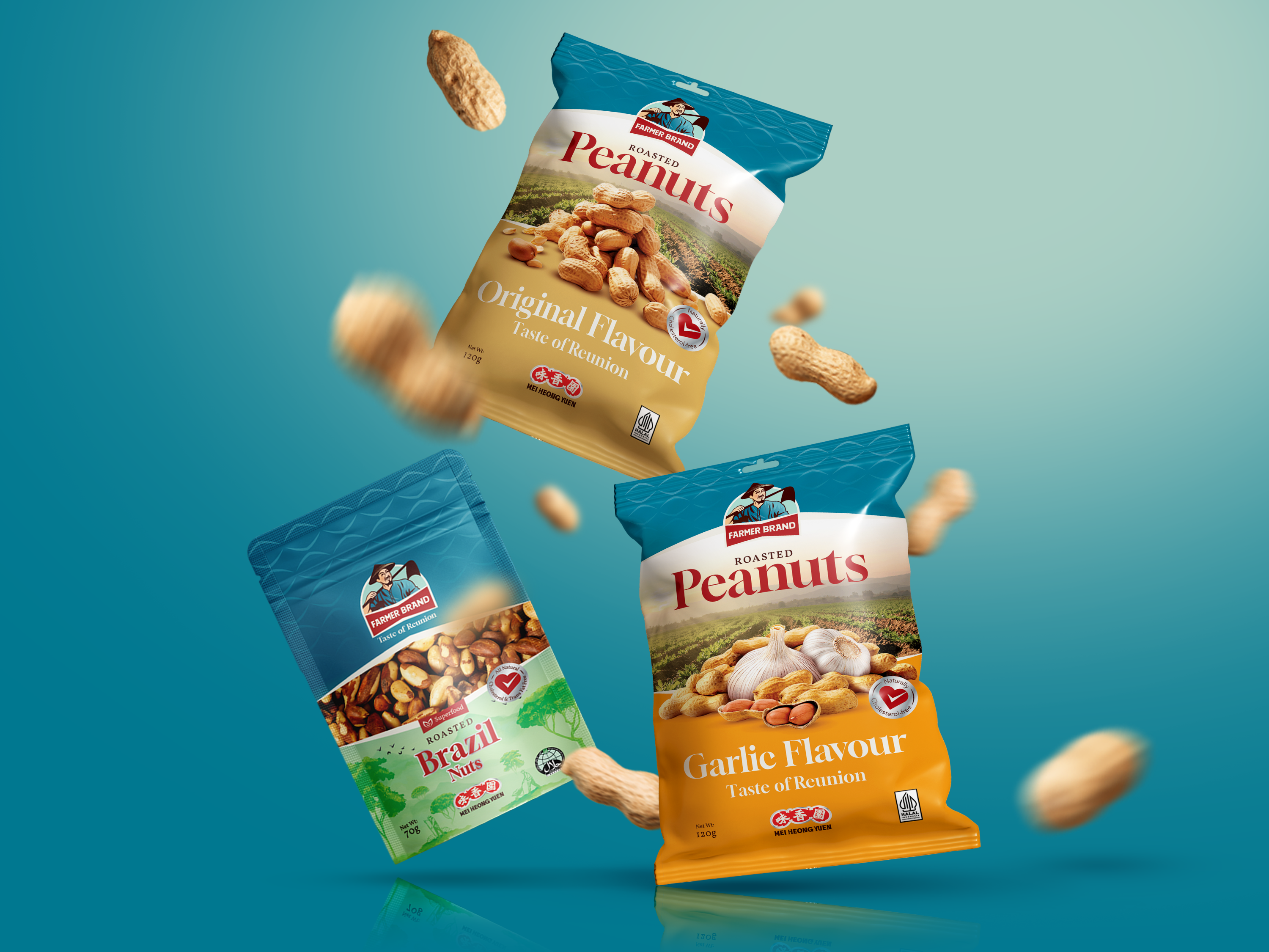
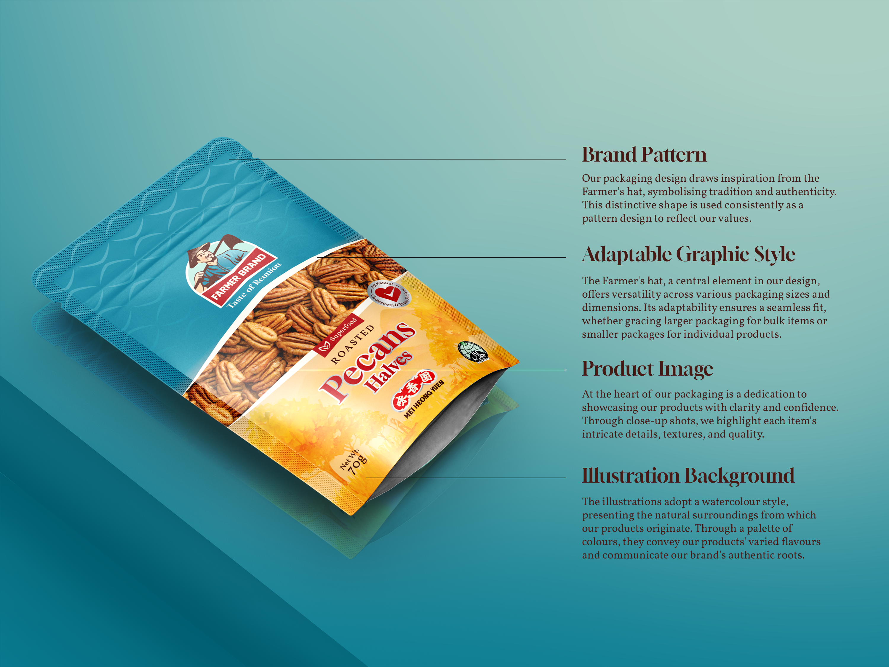
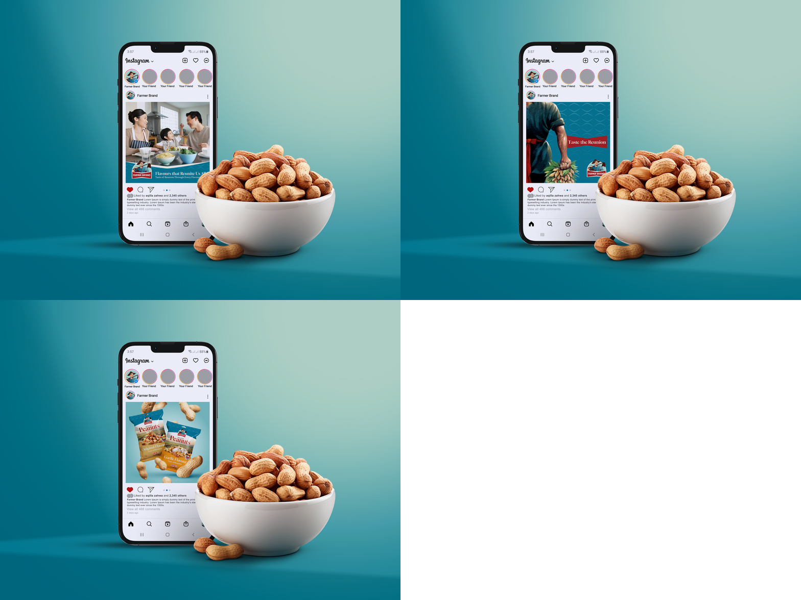
Mei Heong Yuen's logo transforms, embracing global recognition by incorporating Roman letters. The colour palette from the founder's original painting harmonizes teal blue and maroon, seamlessly blending modern luxury with heritage. Farmer Brand's graphic style, a captivating fusion of real-life imagery and watercolour illustrations, skillfully narrates the 'Taste of Reunion,' offering a nostalgic lens into the brand's storied journey.
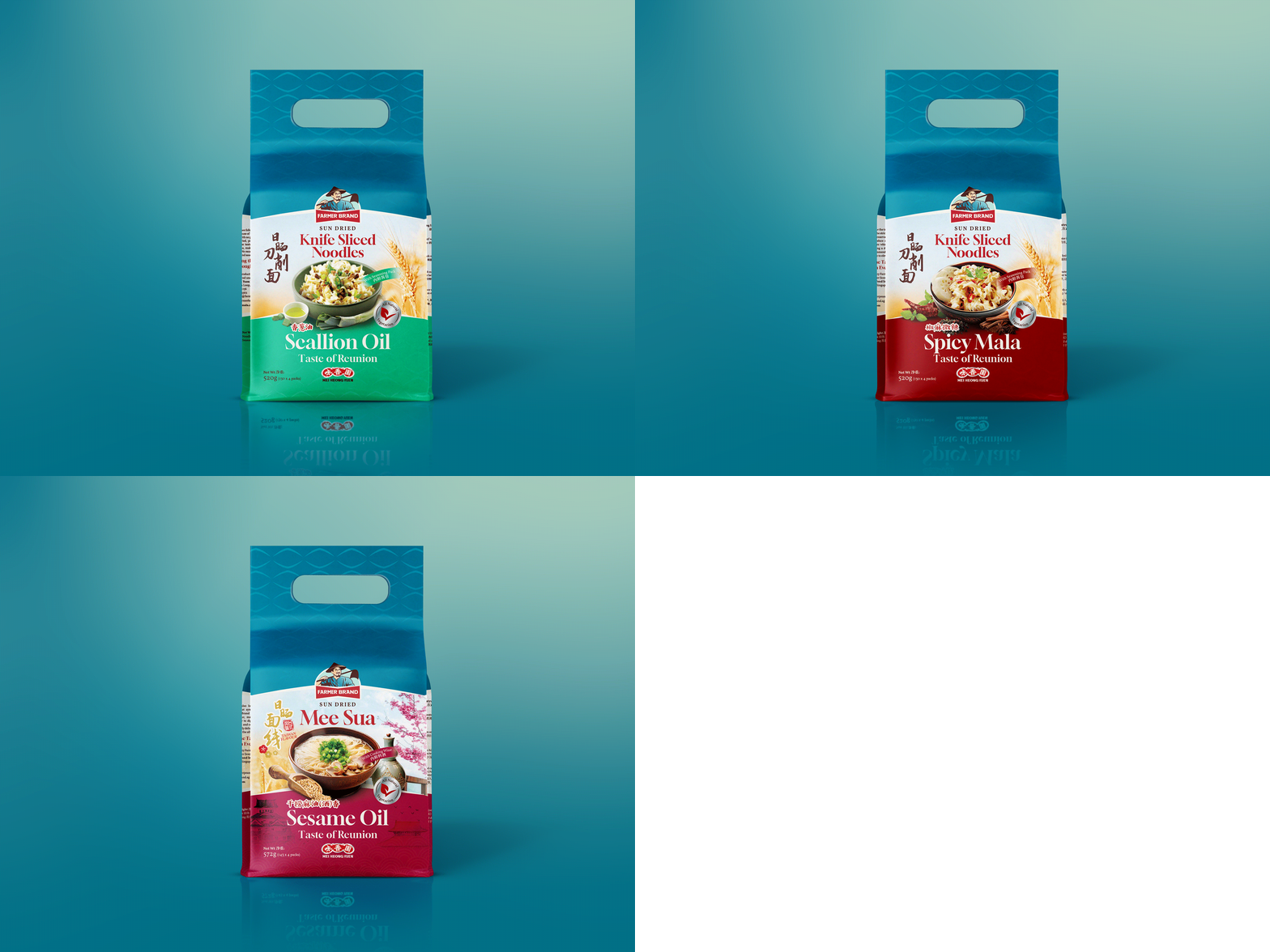
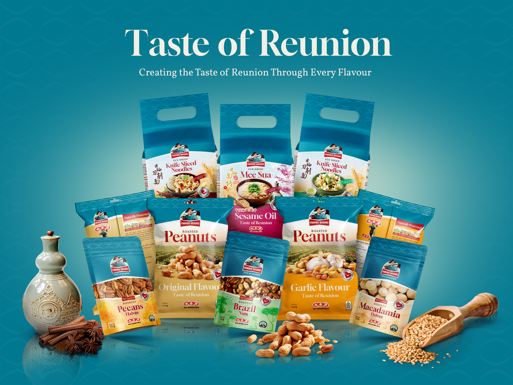
The brand strategically positions itself to resonate with contemporary customer needs, adopting a 'Sub-Brand' architecture that unifies various product brands under the Farmer Brand umbrella for enhanced impact. This revitalized brand identity is a beacon of modernity and effectively communicates Farmer Brand's rich story and professionalism with an international appeal, symbolizing a seamless evolution while honouring traditional roots.