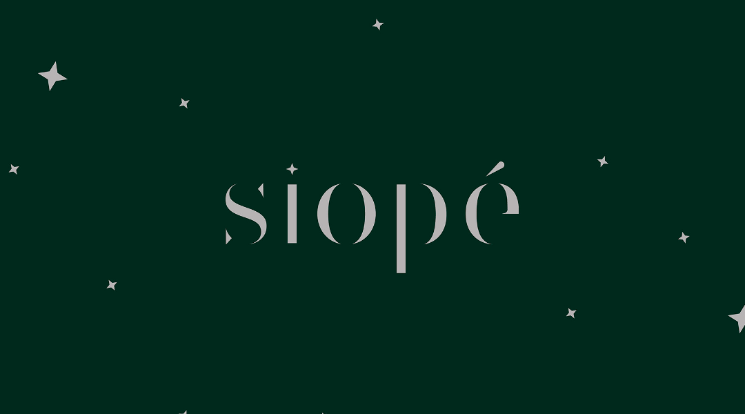
From Ancient Greek, Siope literally means silence.
The project aims to interpret the slow passage of time and the austere silence of nature, transforming them into gastronomic and cosmetic products that enhance their most intimate value. The production cycle is based on respecting the plant's lifecycle, using everything it provides to avoid generating further waste.
The development of the brand involved two distinct but complementary phases:
- On the one hand, the symbol: a peephole through which one glimpses a nocturnal natural landscape with a few plants and a crescent moon, evoking the absence of external and anthropogenic noises, focusing solely on the sounds of nature in its most intimate, wild, and spontaneous form.
- On the other hand, the logotype: created using a font with certain parts of the lettering removed, in order to emphasise the brand's essential nature in its close relationship with nature, its rhythms, and its silence, filled only with what is truly necessary, distant from human embellishments.